Individual investors often think, “Volatility I can weather, big falls I fear.” Estimating potential falls starts by looking to the past. Then, it considers macro or company factors for the future.
Previously, in “Here are 2 ways to avoid being misled about volatility,” the problem was that volatility measures have significant limitations and usually aren’t applicable to the needs of individual investors. More, they are only designed to measure certain types of risk experienced over a recent period. These complications cause structural errors in portfolio design.
When an investor seeks published estimates of potential price drops, different names and calculation methods often frustrate. So, our first objective is to seek a bit of clarity.
Words such as “downside,” “drawdown” and “meltdown” are confusing because they are sometimes used interchangeably and a single term can have multiple calculations. As a rough guide:
- “Downside” can refer to “typical” volatility measures (as with the Sortino Ratio mentioned last time) and sometimes bigger drops as discussed below
- “Drawdown” almost always refers to drops less than “worst case” because of a limiter included in the calculation
- “Meltdown” usually refers to worst case. It can be calculated with a formula from past data, estimated from defined variables of a stress test or driven by scenario analyses.
Ask about the reports you receive from fund managers, “Exactly how is it calculated?”
Here in Part 3 of this series, drawdown and meltdown risks are the focus.
Drawdown risk
Drawdown risk can be calculated in at least three ways within a look-back period:
- Percentile of periodic (e.g., monthly) losses such as 5th or 7th. These percentiles correspond to normal distribution standard deviations (roughly65 and 1.5, respectively) that are used in the “Value at Risk” method. BUT, hazard distributions are usually not normal “bell curve” distributions. Instead they have tails (are “skewed”). By contrast, normal distributions are more likely (but not always) to be found in shorter term trading fluctuations.
- Largest monthly price decrease (sometimes quarterly, but rarely weekly or daily as this becomes more of a trading measure). The limitation is that drawdowns don’t conveniently fit into calendar periods — introducing error.
- Largest peak-to-trough price decrease
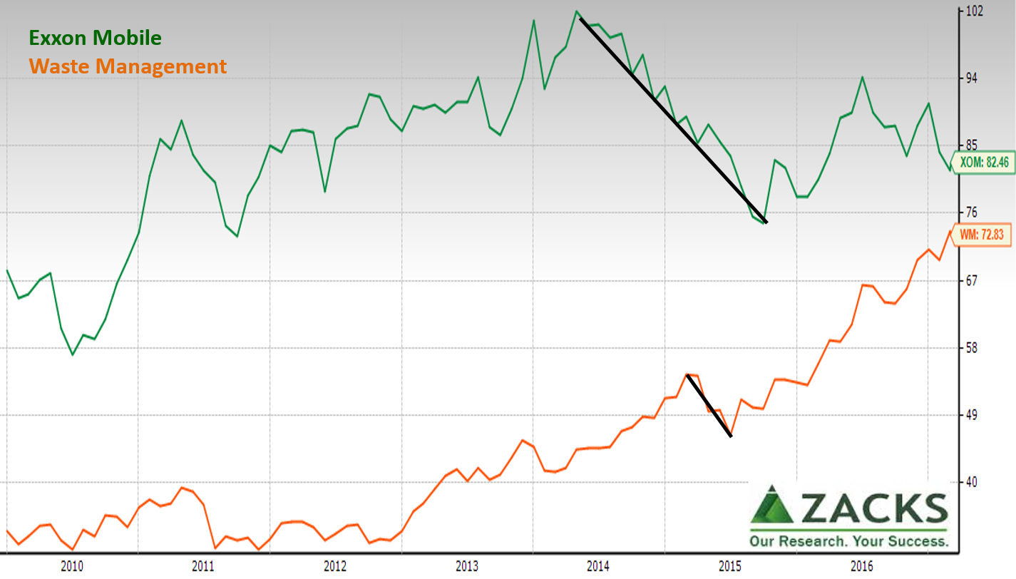
To illustrate some complications, consider this chart of Exxon-Mobile (XOM) and Waste Management (WM).
 With XOM, the peak-to-trough decrease is easily spotted. Notice also this happened over several months so the largest monthly decrease would have understated drawdown risk.
With WM, a complication arises. WM price nicely rose with the Federal Reserve’s large-scale asset purchases (quantitative easing, QE). What is the potential drawdown?
- Stating a small drawdown would imply little risk that the QE-bubble would burst or slowly leak, or that adverse macro situations or WM-specific adverse events would arise
- Extend the period to include the 2008-9 loss, but that was due dynamics different from today
- Minimum price as a percentage of maximum price, with that negative amount being the potential loss — best of these options
There also are non-formula, scenario-based methods, more on those in a future installment.
Meltdown Risk (formula method)
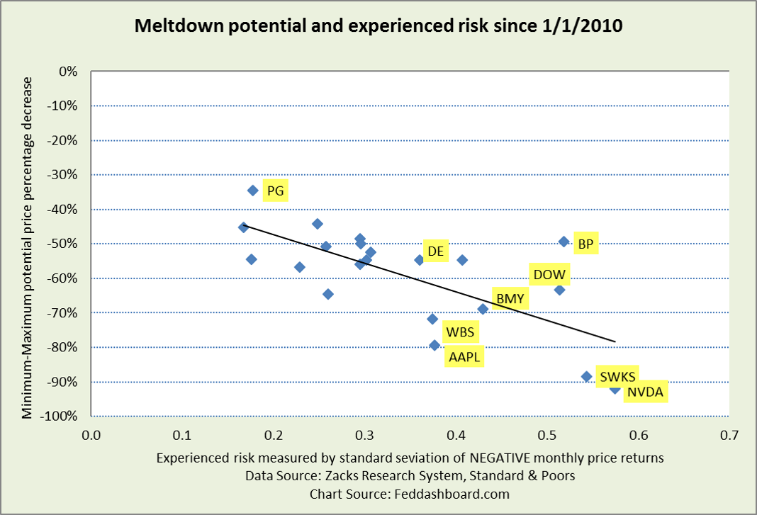
The min-max calculation for meltdown risk provides a worst-case view to contrast with the volatility risk measures calculated in Part 2. Plotting them together provides a view that helps select assets into a portfolio. For reference, the min-max meltdown for the S&P 500 is about -55%.
 The interpretation is that lower risk stocks are in the upper left. More, the chart provides the opportunity to “pick your risk.” For example, a longer-horizon individual investor might be willing to hold during volatility but is more concerned about a meltdown. Thus – returns equal – they would prefer Dow to Bristol-Meyers Squibb (BMY).
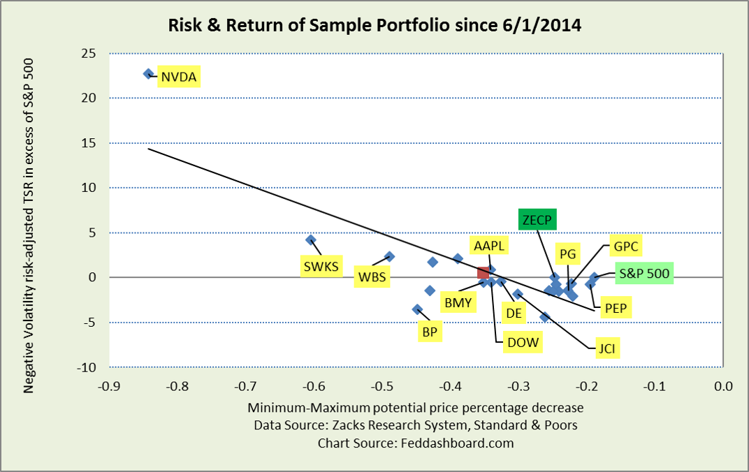
As returns are not equal, the view below begins with the last chart of Part 2, and then divides the return values (vertical axis of that chart) by the risk values (horizontal axis). The result is the volatility risk-adjusted return ratio described in Part 1.
 In this view, Deere (DE) is preferred to Webster Bank (WBS) because Deere has less potential meltdown with similar volatility risk-adjusted return.
To suit your needs, these charts are a starting point for many refinements.
Looking at the dots as real companies and thinking about real situations, you might be eager to adjust the chart to make it more realistic.
If so, that’s great. You are challenging assumptions that complicate risk measurement and introduce error into portfolio design.
Two complicating assumptions
First, look-back assumption — the immediate future will be like what was recently experienced. For typical trading volatility (traders just pushing markets up and down to make money on the changes), this is reasonable. It is not true and especially erroneous for anyone concerned about downside losses from known causes that occurred before the selected period. Further, a period selected on a calendar basis will wrongly measure risk depending on how price patterns cross calendar periods.
Second, price-as-predictor assumption – looming risk is visible in price patterns captured in risk measures. It is not true beyond reasonably frequent patterns with reasonably known dynamics.
- Dynamics hidden in a dot – insufficient pattern is reflected in a risk ratio plotted as a dot
- Price-based approaches assume past trends – moving from dots to chartist approaches trends can be seen, but those trends can only compare to past highs and turns. Yes, price chart technical analysis certainly improves trading. But, chartist approaches can’t “see” inappropriate mortgages defaulting, cascading into securities priced in dark markets and then cascading into public markets. Viewing price in isolation makes it difficult to spot bubbles, as we’ve illustrated previously in “Your quick guide to spotting bubbles.”
- Price-based approaches generally assume stable ratios between price and various fundamentals (e.g., price-sales ratio) and that fundamentals reflect company strategy and execution. Of course, fundamental ratios are often not stable – that’s in the next installment.
At this point, if you’re thinking, “Can’t I just trade my way out of these complications?” and are a trader at heart, then learn from our editorial board members and top traders Steve “Sarge” Guilfoyle and Mark Newton.
In summary:
- Meltdown risk is usually more helpful to individual investors than volatility risk
- Yet, formula-based methods still suffer from the limitations of look-back period and price-as-predictor assumptions
- The more clearly limitations are understood the clearer to investors is the value of using a better investment method
Next time: “To what extent do price increases represent risk versus justified price improvement due to fundamentals?” An answer comes from exploring the dynamics hidden in a dot. Click here to read “Cut your risk and boost your return – use the right ratios.”
To learn more about how to apply these insights to your professional portfolio, business or policy initiative, contact “editor” at this URL.
Data Geek notes:
- Data are monthly from Zacks Research System, Interactive Chart exports to Excel.
- To get TSR output in ZRS, click the “Dividend Adjusted Price” radio button in Chart Options menu.

