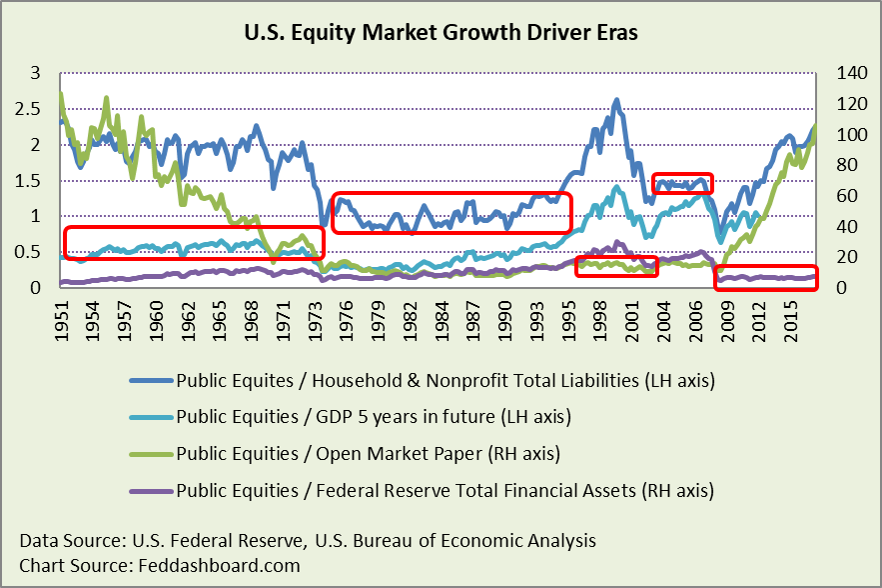
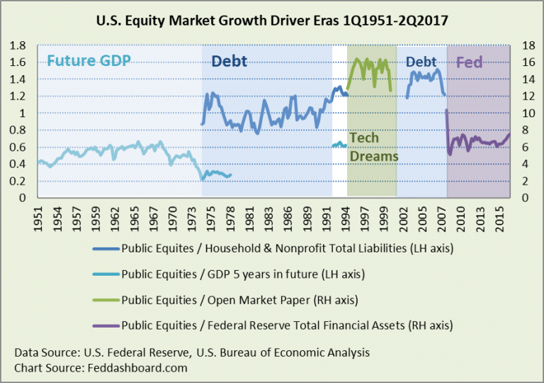
In each of five equity market phases since 1951, just one factor explained over 90% of equity market growth in that phase.
- This reinforces the need for a macro-driven portfolio – first in risk management, then in equity selection
- Fundamentals follow macro, especially business model-based investing
- Because macro patterns change slowly, it’s less stressful investing
- ETFs were most aggressive in growing the “Trump bump”
In August 2015 – surprising more than a few readers – we wrote how just one factor per phase explained over 90% of the growth in each of five market phases since 1951. Now, that analysis is updated with the most recent data from the Board of Governors of the Federal Reserve System.
The idea behind the chart below is simple, when the item of interest (U.S. Corporate Equities in our case) is divided by a causal or “explanatory” factor (future GDP, debt or others) a flatter line shows that the causal factor explains more of the variation in equities. Showing tails gives the curious reader a view of the trend before and after the more stable period.
 While there are five phases, there are only four factors, as household and nonprofit debt appears twice. The first appearance begins with growing credit card debt; the second with growing mortgage debt. Open market/commercial paper is a proxy for the speculation of the telecom and dot com bubble, but due to Dodd-Frank regulation and central bank policy, such paper isn’t currently a helpful proxy.
Again, there is more background in the original analysis, “One force drove each stock market boom – do you know which?” and then after receiving more than 1,000 comments, a follow-up, “Comment replies for ‘Fed caused 93% of the entire stock market’s move since 2008’”.
These are relatively stable phases, R-squares each above 90%. Shown below is the history for each factor.
Of course, there are causes and consequences to the 90%. The U.S. mortgage meltdown had consequences to other countries. Central banking decisions, divergence between monetary and fiscal policy, and political unrest in other countries were causes for funds flowing to the U.S. Debt becomes spending that rolls up to GDP. Business sales are just over 75% of GDP, so fundamentals come full circle. Every blip even in a period with little trend has a cause.
 In the past two years, the most notable change has been the “Trump bump,” as seen in the increase at the end of the purple line in the first chart. This bump added to the current market bubble. The current bubble is higher and broader than the dot com bubble, as described in “P/E ratios are blind to two big price drivers.”
Market participants explained the bump as hope for a repeat of Reagan-era regulatory and tax reform. True, reform in economic policy, including monetary, is much needed. But, the expectations missed at least three big differences from 36 years ago:
- Global tech and trade transformation had just begun, mostly through imports from Japan. Today, as we’ve written previously, production requires less money input for physical output, neutral interest rates are lower, potential GDP is higher and “inflation” far more about product costs and shopping trends than monetary policy.
- Housing is much less affordable today, especially to recent college graduates with debt. Today, worse than we’ve written previously, house price affordability is roughly 300% worse than when the Reagan Administration declared it a problem.
- More household debt, cutting the magnitude of debt-fueled spending that boosted the Reagan recovery. Here, as we’ve written previously, debt is not only higher, but the debt deleveraging after 2008 was aborted.
These differences are reasons the past is not a good predictor of the future.
What’s new that could explain the rise since election day? To help the curious explore, first recall that stock market value is share price times shares outstanding. The market value increase has been about price. Since 2Q2011, shares outstanding have fallen about 5%. By contrast, from 1971 to 2011 shares outstanding increased by 76%.
Price increases generally come from more cash chasing shares because:
- More cash in the world
- Investors are fleeing low yields in non-equities
- Rewarding company fundamental performance due to either higher sales or lower costs – the best performance comes from better business models
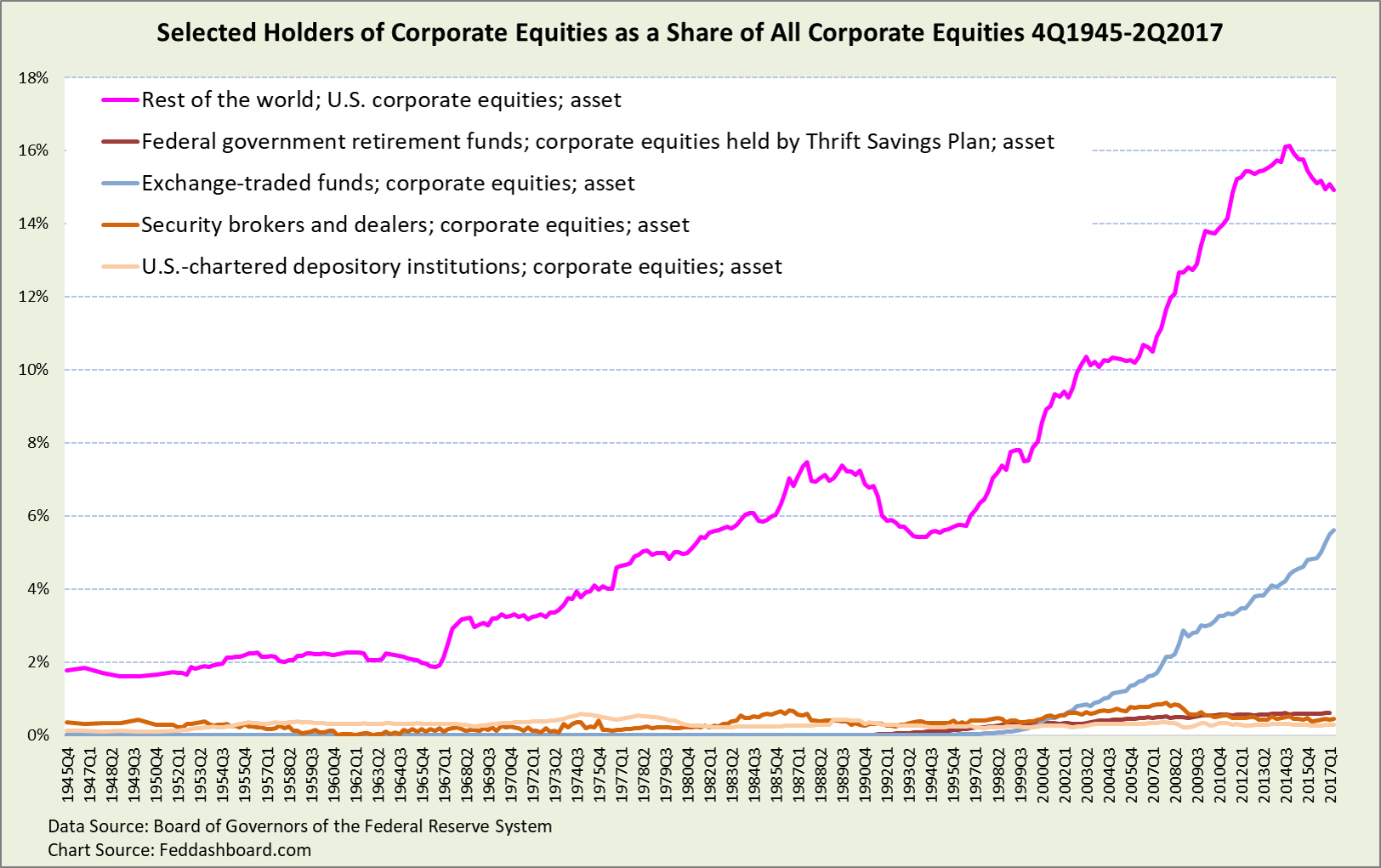
We’ve discussed fundamentals extensively in our Market Fundamentals section, so here we update the percent change in the share of corporate equities held by type of holder. For example, parties in the rest of the world hold about 15% of all U.S. corporate equities.
- Shown below are those holders that most contributed to the “Trump bump” by most growing their share of all equities from 3Q2016 to 2Q2017. Think of it as market share of equities – pieces of pie.
- Not shown because it would squash all other lines to the bottom of the chart is the households and nonprofits type of equity holder. This type fell from 95% in 1945 to 35% in 1Q2009, then grew to 40%.
- Not shown because it has been falling relative to direct holdings since 1Q2010 and flat since 3Q2016 is Households and nonprofits holdings of equities via mutual funds
- Not shown to avoid cluttering the chart are holder categories decreasing such private and state pension funds
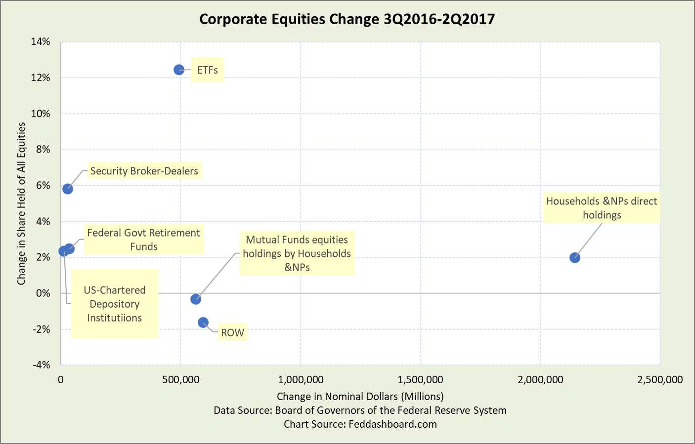
 Other holder types mentioned but not shown above are big. Thus, with little growth or decline in share, their dollar contribution to the “Trump bump” was large.
Below, change in share of all equities is on the vertical axis and change in nominal dollar on the horizontal axis. Notice dramatic differences. For example, Exchange-Traded Funds (ETF) share growth was over six times that of household direct holdings, but ETF dollar growth was less than one-quarter of household direct holdings.
 Raising eyebrows is the growth of ETFs compared to other holders because of how ETFs can be “blind money” following broad indices with little discernment. This creates an opportunity for a more careful investor to take advantage of the masses – a flavor of the “Greater Fool” theory.
In short, keep close watch on central bank holdings, especially the U.S. Federal Reserve, flows from other countries into U.S. equities and ETFs.
For investors, there are alternatives:
- In public equities, don’t buy broad indices. Instead, start portfolio design with macroeconomic and geopolitical, then allocation design/risk management and then to fundamentals with business model-based investing. For investors who wish to be more active and move into trading territory, add your preferred event, quant or technical technique. However, always watch for warnings of sentiment churning your path.
- Consider private equities, using caution in those sectors bubbled by the Fed, notably residential real estate.
To learn more about how to apply these insights to your professional portfolio, business or policy initiative, contact “editor” at this URL.
Data Geek notes:
- Federal Reserve corporate equity data is primarily from the Center for Research in Security Prices
- The “explanation” percent is based on R-squared, this is not our preferred measure of fit/variation but used for convention
- That the Fed’s quantitative easing program is behind 93% of the market growth should not be a surprise. Chairman Bernanke described this mechanism in his August 31, 2012 speech; see especially his references to James Tobin. “Declining yields and rising asset prices ease overall financial conditions and stimulate economic activity through channels similar to those for conventional monetary policy. Following this logic, Tobin suggested that purchases of longer-term securities by the Federal Reserve during the Great Depression could have helped the U.S. economy recover despite the fact that short-term rates were close to zero…” The Fed set out to achieve a “wealth effect” for growth – raising asset prices to stimulate spending on tangible goods and services. Instead, what happened was far more asset price increase than spending on tangible products — thus an asset bubble.

