Caution is needed when using risk measures that “hide dynamics in a dot” or are inappropriate for an investor’s situation. Steps toward clearer insight include separating downside from upside volatility and separating trend from volatility.
Previously, in “Biggest mistake managing risk,” the problem described was that investors don’t use risk measures matched to their situation. Risk includes recently experienced risk and “meltdown” risk. Recently experienced risk includes trading volatility. Meltdown risk includes large losses that either happened prior to an evaluation period (e.g., more than three years) or never happened (e.g., how the Federal Reserve’s “wealth effect” turned bubble will be resolved).
The solution starts by selecting measures more relevant to an individual investor’s:
- Cash flow patterns – when an investor buys and sells for liquidity based on their personal situation. Of course, this assumes individuals have tiers of investments with cash and low volatility assets for their immediate needs and reserve, as encouraged by the Retirement Income Industry Association.
- “Look-back” period — reflecting tangible macro that drives markets and personal returns, not an investment company’s reporting calendar
More, this requires investors be alert to what is hidden in summaries such as a risk-return ratio or a dot on a chart.
Volatility views
This Part 2 takes a closer look at limitations of price volatility, with two views for texture.
First, insight from negative volatility.
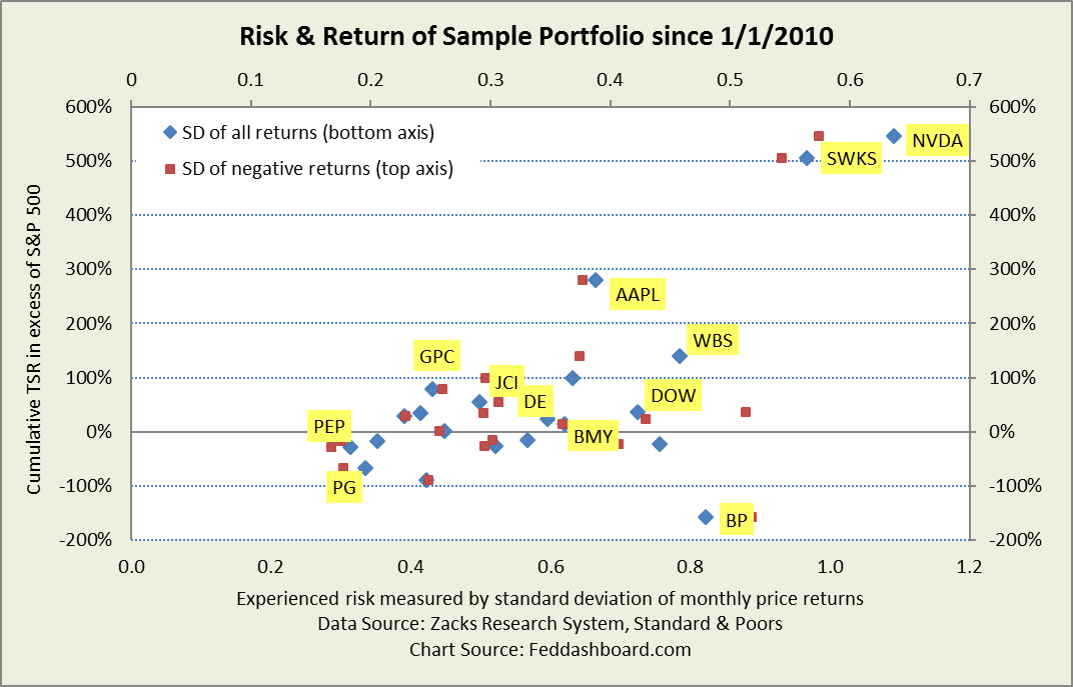
In Part 1, the standard deviation of all monthly returns was shown. This could be appropriate for traders who make money whether the price is going up or down. However, it isn’t relevant to investors who are risk averse, and who love upside and fear downside. The picture below compares standard deviation from all monthly returns (blue diamonds from Part 1 – bottom axis) to just negative monthly returns (red squares – top axis). Because the stocks have different patterns of positive and negative returns, they shift differently.
 On average, the standard deviation of negative returns is about 58% of all returns.
When selecting stocks and crunching risk numbers, differences are mathematically more important than they appear on a cramped chart.
Strengths of negative volatility view:
- More appropriate for risk-averse investors, rather than traders. This is also why the related Sortino Ratio is preferred over the Sharpe Ratio.
- Partially adjusts for positive trends, such as those driven by Quantitative Easing (QE), that would otherwise overstate volatility
- Includes volatility from multiple sources
Weaknesses:
- Limited to experienced volatility during measured period and data frequency
- Doesn’t reflect cumulative effect of losses across periods
- Doesn’t reflect different data patterns that result in similar standard deviations. For example, Kraft-Heinz (KHC) and BP had similar standard deviations of about 0.18. But, KHC had negative returns in only 23% of months whereas BP was negative in 57% of months.
- Not relative to a benchmark
In addition to negative and all deviations providing different pictures, recall that risk measures are sensitive to time.
- Calendar periods matter for professionals on performance plans, but not for individual investors who care about their personal fund amounts.
- Evaluation periods are more insightful when tied to macro. January 2010 has been used so far because it coincides with a macro driver – the start of QE. Summers of 2013, 2014 and 2015 are also key macro points.
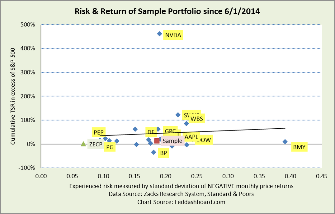
To show how time changes the picture, the view below starts at June 2014, a point when QE effects on U.S. equity markets slowed.
 Risk-return charts show months or years in a single dot, thus they hide stock dynamics in a dot. Here, Nvidia stands out because of its meteoric rise in the past two years. Bristol-Meyers Squibb’s (BMY) position reflects its price decrease since July 2016.
Second, insight from risk related to market movements.
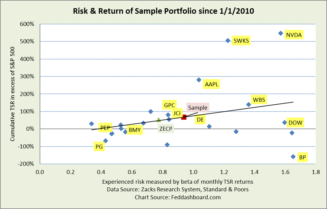
This is “systematic risk” or risk that isn’t company-specific (‘idiosyncratic risk”). This risk is measured by the slope or coefficient (denoted with the Greek letter beta) of the best-fit linear regression (“least-squares”) line between a stock and a market (S&P 500) returns. “Best-fit” means it is the line where differences in the dots above the line and below the line are equal.
 Strengths of beta view:
- Adjusts for trends – only if they are linear
- Relative to S&P 500, especially convenient for this chart as returns are also relative to S&P 500
Weaknesses:
- Limited to experienced volatility: 1) related to the benchmark, 2) during the selected period and 3) visible in data frequency
- Doesn’t reflect cumulative effect of losses across multiple periods, unless linear and sustained
Compare & contrast
You’ll notice the two charts above include the sample and Zacks Earnings Certain Proxy (ZECP) portfolios. In all cases, the ZECP provides better risk-return (asset-S&P500/risk measure in the chart) and shows there are improvement opportunities for our example investor. Again, the risk-adjusted return is a ratio, so our example investor could improve his/her expectations by seeking more return (numerator) or lower risk (denominator).
In comparing stocks, our example dividend-seeking investor might suggest that dividends are the reason for holding a low risk-adjusted return stock. However:
- Dividends require their own risk analysis as discussed in “Dividends in danger? Avoid 3 mistakes”
- Dividends are 1) received without transaction costs needed to sell shares, but 2) currently taxed more than long-term capital gains
Improve by avoiding bias
Any improvement discussion reminds of the need to avoid investment process bias, including:
- Recency bias. Don’t assume the recent past will continue. Instead, look back at different lengths of time with specific macro, market and company drivers. Then look forward. An investor wins with a superior view of the future.
- Screen for stocks about which you don’t already know with superior risk-adjusted return compared to those you do know; then learn those businesses to determine why returns are above expectations.
In summary:
- Benefit of these charts is they conveniently summarize risk and return
- Limitations are what is hidden by summaries. From a chart design perspective, this includes 1) selection of look-back period and 2) exactly how volatility is calculated (including data frequency). From a data perspective, this includes 1) dynamics hidden in a dot and 2) downside beyond recently experienced price volatility.
- “Industry standard” measures easily mislead because assumptions often don’t hold.
- Select a look-back period relevant to your question(s) and a volatility measure relevant to your cash flow/liquidity needs
- To improve outcomes, start with a view of what will be different in the future, remove stocks not likely to fare well and screen for new stocks more likely to perform. In other words, use the methodology to contribute to your thought process. Focus on outliers (positive and negative) to question your assumptions and determine your strategy to capture value.
Next time: exploring measures of downside risk beyond recently experience volatility, including “meltdown.” Click here to read “How far could price fall? Three ways to gauge stock drops.“
To learn more about how to apply these insights to your professional portfolio, business or policy initiative, contact “editor” at this URL.
Data Geek notes:
- The less frequent the data intervals (e.g., monthly versus daily) used to calculate returns the larger the swings and higher standard deviation
- “Downside” volatility calculations vary. Some are based on monthly returns below an average. Some are based on monthly returns that are negative (as done here).
- For plotting the sample portfolio’s average, the portfolio was calculated as equal-weighted
- Data are monthly from Zacks Research System, Interactive Chart exports to Excel
- To get TSR output in ZRS, click the “Dividend Adjusted Price” radio button in Chart Options menu

