
Not measuring risk in a way that matters to you is the most basic mistake. To avoid losses, first understand how popular risk measures work and can mislead; second, select measures that best answer the questions that confront you.
“One force drove each stock market boom – do you know which?” illustrated how since the early 1970s, over 90% of equity market gains have been due to growth in debt – first credit cards, then broader consumer, housing and commercial & industrial debt, and the FOMC buying Treasuries and Mortgage-backed Securities as part of “Quantitative Easing” (QE).
“Fed’s bubble risk flags bigger danger you’re stuck with” described how investors love and fear the Federal Open Market Committee’s (FOMC) “wealth effect” turned bubble. That distinct force was different from the churn that followed, including speculation on interest rate hikes. Hike churn was distinct from speculation on national elections and decisions new leaders might make.
Past patterns of normalcy no longer matter because drivers in our economic ecosystem have changed. Decisions by central bank monetary policy committees hit faster and harder than the debt decisions of diffuse millions of consumers and lenders. Volatility grew through a new feedback loop between central banks and financial markets.
Humans like to think about return more than risk because positives are more enjoyable. Return measures are also few — mostly about price change and dividends in a period.
Risk – by contrast – has diverse measures. For example, some risks relate to your situation at a point in time and holding period — trading decision today, college payments in ten years or medical emergency potential. Other risks are from causes beyond you – geopolitics, macroeconomics, trader behavior, a company’s new product decision or even “fake news.”
Risk for the dividend-seeking individual investor
To illustrate, consider a dividend-seeking investor with a portfolio of roughly twenty companies:
- Mostly large cap dividend payers such as Deere, Dow, GE, Johnson & Johnson, Verizon and Waste Management
- Plus a few technology companies such as Apple, Skyworks and Nvidia
Dividend risk was discussed in “Dividends in danger? Avoid 3 mistakes.” Here, the view broadens to price risk.
“Volatility” is probably the most popular measure of price risk. It is the standard deviation of returns at a frequency (e.g., intra-day or monthly) from a point in time. But it is:
- Limited to risk experienced from that point in time
- Offers no comparison to benchmark, no sense of trend, no differentiation between upward and downward moves, no differentiation between daily trading and plunges to due to environment or company events
- Assumes a bell curve (standard normal distribution) that is often unrealistic
In response to limitations, other measures have been created. Investopedia provides a helpful overview.
Steps to a more relevant risk measure
Measuring risk starts by asking, “What most threatens me?” For example, our investor faces two big categories of price risk: experienced and “meltdown.”
- “Experienced” refers to price ups and downs since the beginning of a period.
- “Meltdown” refers to risk that hasn’t been experienced recently. It is the potential largest price drop from a combination of macro (debt, Fed bubble slow leak or burst, or political), broad market and company-specific risks. This includes “drawdown” risk that is the largest price drop over a period being evaluated. Caution, “drawdown” is calculated in several ways. Stay tuned for more in an upcoming analysis.
For experienced risk, a risk measure becomes more relevant to you by selecting attributes for each of four characteristics:
- Time – Given different companies bottomed at different times after the credit bubble burst and QE was so dominant, our measurement starts in 2010.
- Return – Given our example investor seeks dividends; our return measure includes dividends and price movements — Total Shareholder Returns (TSR). Of course, an investor’s dividend yield depends on what they paid for a stock and tax situation.
- Benchmark — Given that an equity investor’s alternative to specific stocks is often a broad index, rather than using a “risk-free” three-month Treasury bill, the S&P 500 index is used here. Users of Zacks Research System would probably prefer Zacks Earnings Certain Proxy (ZECP) because of its enduring risk-return performance and its role in the Zacks Valuation Model. ZECP includes earnings-stable companies, excluding high growth and interest rate-sensitive companies.
- Risk experienced – Given simplicity as a starting point, standard deviation is used here. While standard deviation has many limitations, some will be addressed in meltdown risk and some in refinements to experienced risk – stay tuned.
The risk-return scatter plot view is dramatically different from return alone.
Stocks that improve the average of a portfolio’s overall risk-adjusted return are toward the upper left – IF history repeats.
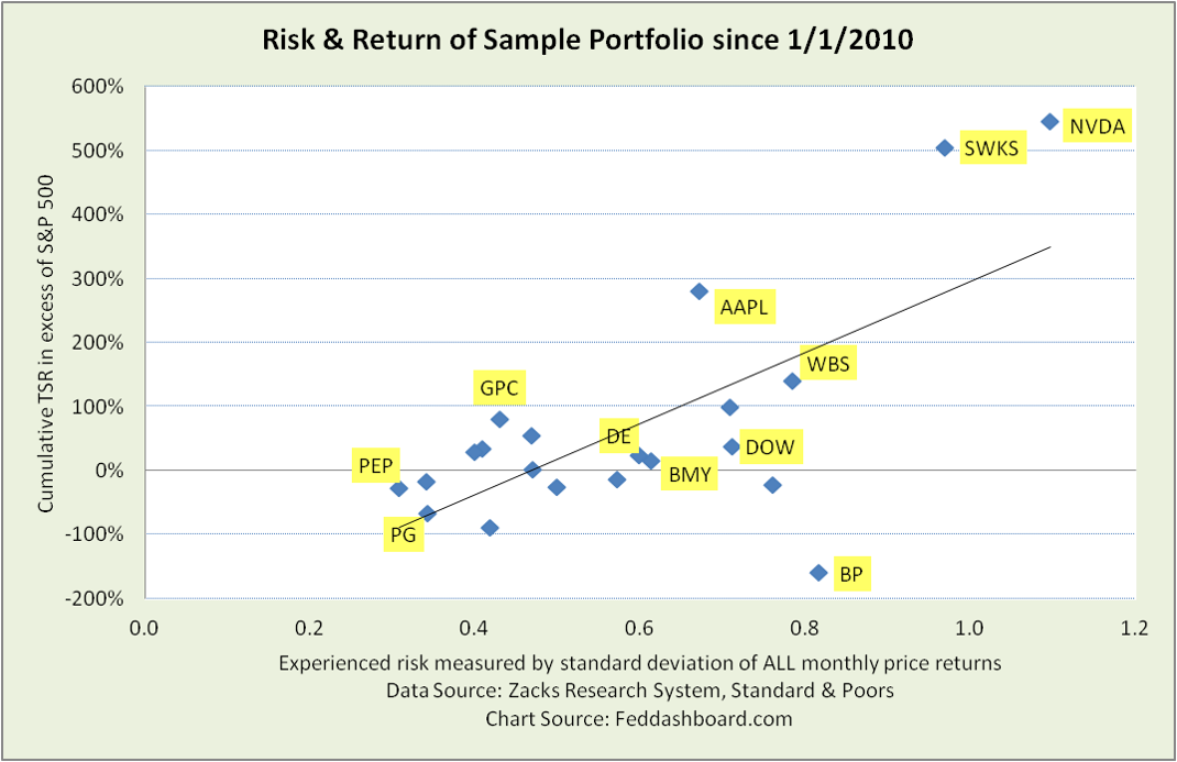 In search of superior risk-adjusted return, an investor reviewing this chart could:
- For TSR, review stocks underperforming the S&P 500 to check for recent improvement or expected improvement
- For price risk, review all stocks with excessive risk given their return. For example, Deere (DE) and Bristol-Myers Squibb (BMY) are close on the plot, but DE has higher returns and lower risk.
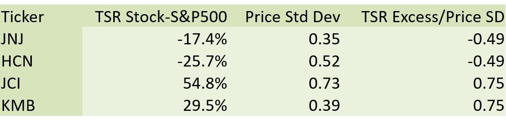
Some investors say, “Just give me one number.” For this, return is divided by risk to create a risk-adjusted return ratio. Of course, the danger of one number is that it hides insight on why that number could be higher or lower. For example, Johnson & Johnson (JNJ) and Welltower (HCN) both have similar risk-adjusted return (TSR/SD); JNJ gets there with lower return and risk than HCN. Likewise, Johnson Controls (JCI) and Kimberly-Clark (KMB) have similar risk-adjusted return; KMB has much less risk and return.
 Avoiding the pitfalls and gaining the benefits of risk-adjusted return is next in our series – click to read “Here are 2 ways to avoid being misled about volatility.”
To learn more about how to apply these insights to your professional portfolio, business or policy initiative, contact “editor” at this URL.
Data Geek Notes:
- Return is cumulative to 1) sync an evaluation period with a macro trend and 2) avoid suggesting that yearly returns are more similar than they are in reality.
- As an evaluation period and macro should be linked, there is also reason to start an evaluation clock in summer 2014 when the traders began undervaluing QE in anticipation of QE ending or summer 2015 when markets struggled in anticipation of Federal Funds rate increases.
- Measures are sensitive to calculation nuances. For example, monthly data is used here. Nuances are why measurement sources should not be mixed.
- There are similarities to popular ratios. As there are many ratio variations and calculation nuances, those ratios are not mentioned here to avoid confusion.
- Yes, for you pros, the normal distribution assumption is currently violated; that’s for an upcoming analysis.