
Recent price increases are concentrated in products over which central banks have little control. When product price change causes are beyond a central bank’s control, monetary policy gets frustrated fast.
“Inflation is back” has been a big headline. Is that true?
- Yes, if “inflation” means the weighted-average price change of products
- No, if “inflation” means price increases caused by monetary factors or widespread price increases
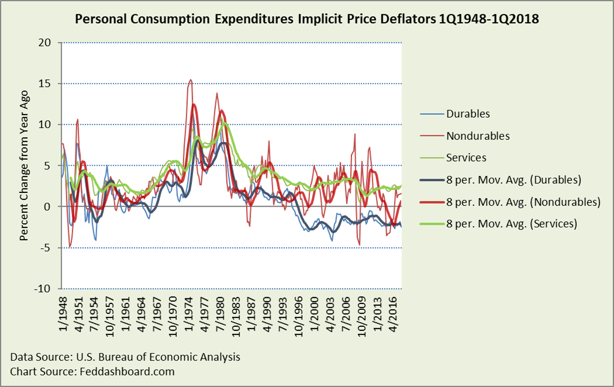
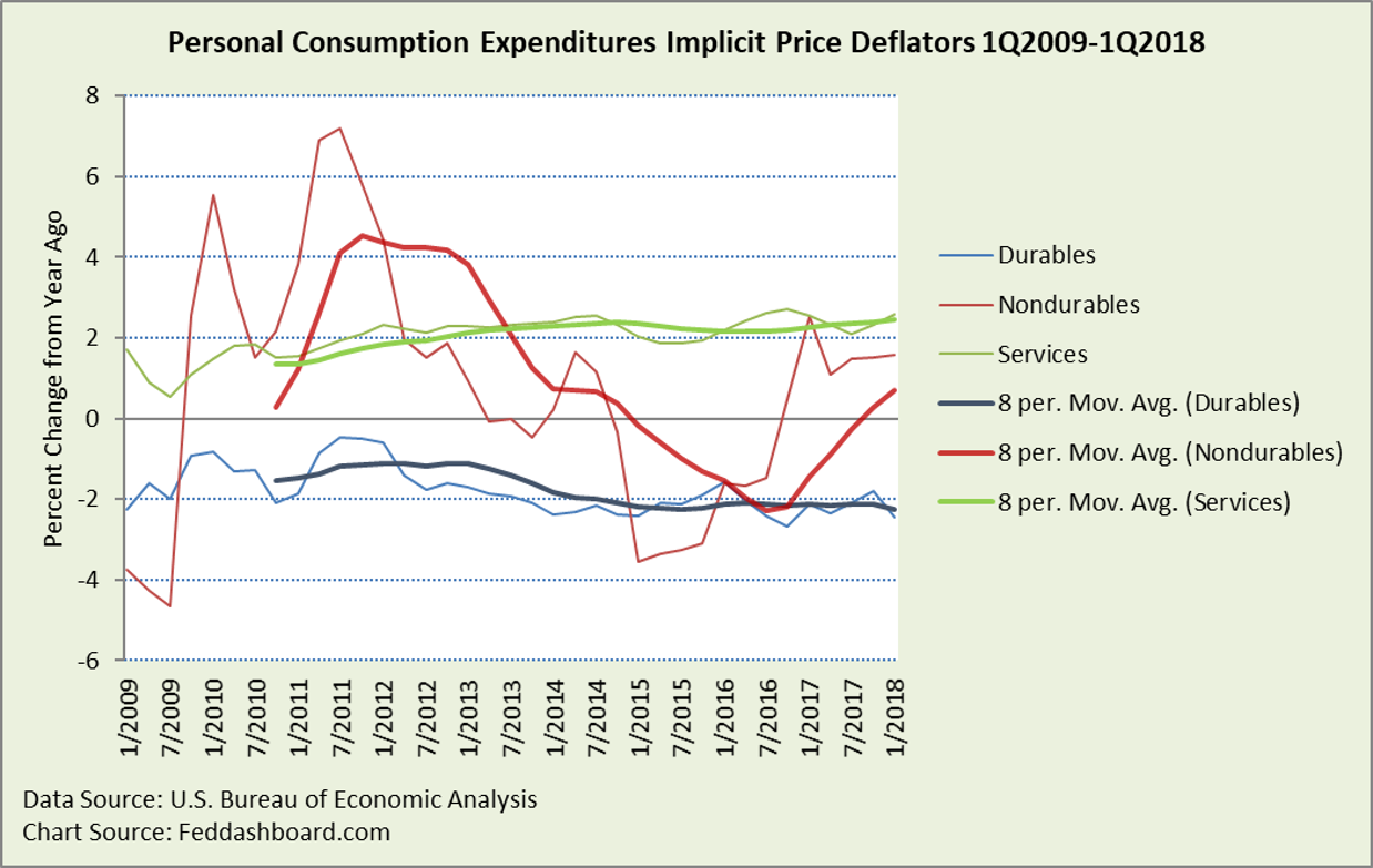
Prices continue on their recent trends
- For services, an uptrend since 2009
- For nondurables, an uptrend since 1Q2016
- For durables, a downtrend since 2009
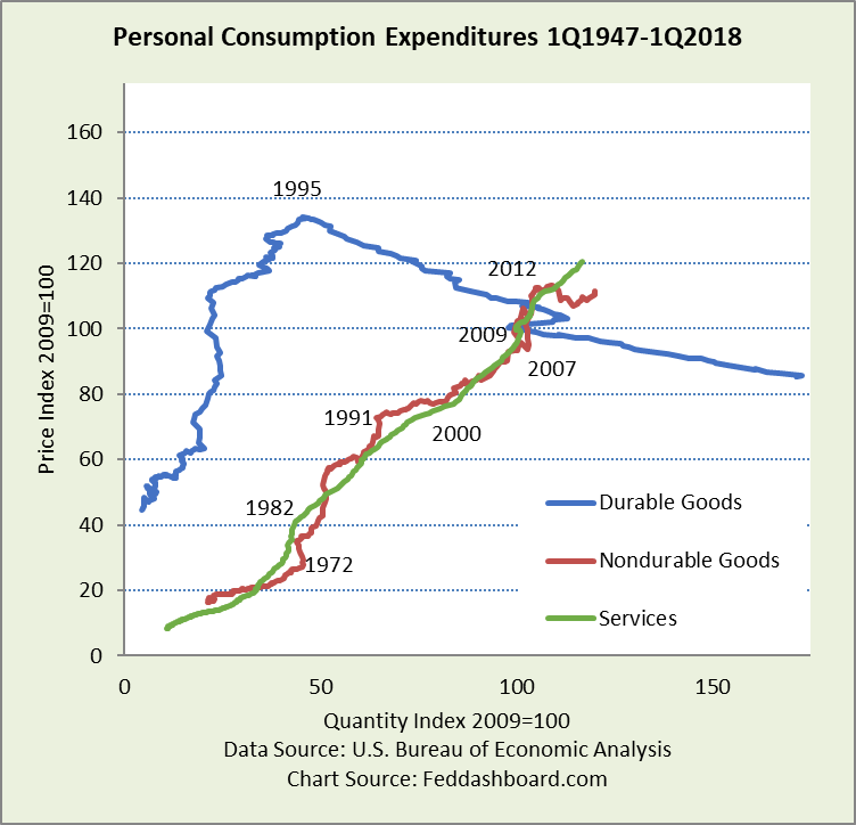 The dramatic change came in the mid-1990s when the average of all durable goods prices began falling and shoppers bought more. This reflects decades of falling global costs. The flip-side is that higher prices tend to cut purchases – stagflation, an up-and-back move on a downward-sloping curve.
Focusing only on price, the eight-quarter moving averages for services and durables have been on relatively consistent trends since the mid-1990s, with services dropping more in 2009.
 Nondurables are at the mercy of energy price dynamics, including exports of U.S. oil while U.S. prices are rising and geopolitical speculation.
Of interest is whether services will continue to rise as into the 2008 crash. Services are sensitive to housing, health care, and wages (more than in goods production). In measuring price change, a key question is whether higher prices (especially in health care) are for better services or just pure price increase.
Zooming in on the time since 1Q2009, there has been a slight uptrend in services and slight downtrend in durables.
 As services are about 6.3 times the size of durables, the services trend dominates. Adding to average price increase has been the jump in nondurables (mostly energy) that are almost double the size of durables.
Higher prices are concentrated by product
The recent upward price pressures started mid-2016, primarily energy, then some in food and services.
Top product price increases come from comparing the 1995-2016 trend (1995 a pivot point from the global tech and trade transformation) with the trend since 2016.
To see what tugs on the longer-term average, look for prices that changed most since 3Q2016 – products farthest left or right. For example, the audio equipment average annual change was -2.8% from 3Q1995 to 2Q2016, then -12.7% from 3Q2016 to 1Q2018.
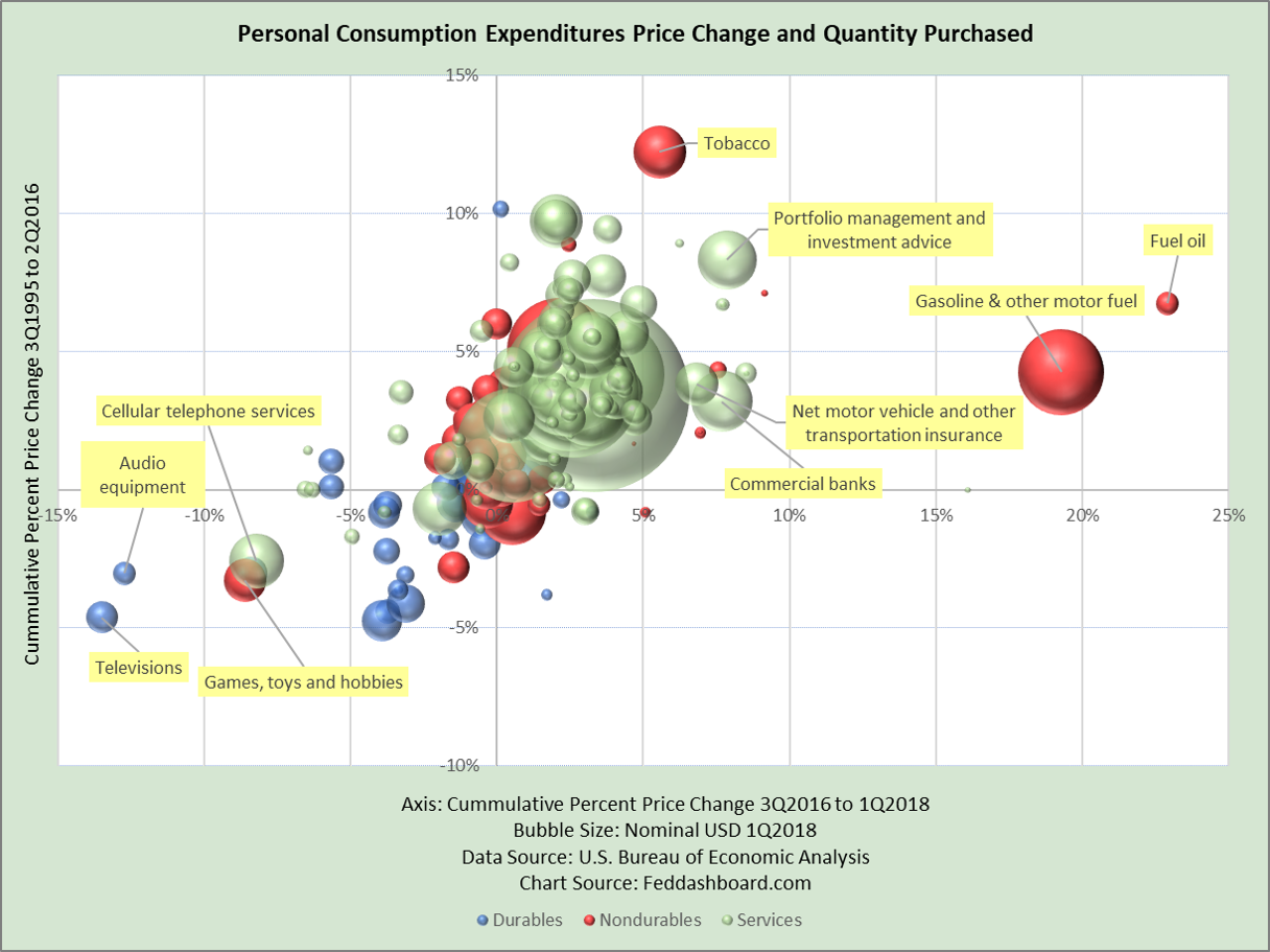 Central banks have little influence beyond foreign exchange rates on the prices of products that have changed most from their longer trends — Audio equipment, Televisions, Games, toys and hobbies, or fuel. In its regulatory capacity, the Fed has influence over financial services prices.
By contrast, looking at hundreds of products reveals specific technology, management technique, trade, online shopping, and regulatory, tax, and subsidy causes of product price changes.
Products with price increases since 3Q2016 that far exceeded their increase since 1Q2009 include: Eggs, Children’s and infant’s clothing, Gasoline, Fuel Oil, Flowers, seeds, and potted plants, Sewing items, Electricity, Home health care, Intercity buses, Membership clubs and participant sports centers, Repair of consumer electronics, Trust, fiduciary, and custody activities, and Homes for the elderly.
Of course, products have different trends over decades – some up, some down, and some widely fluctuating. These differences are shown with price-quantity plots in “Solved – the missing inflation mystery,” “Epic Econ: “Breaking the back of inflation” – lessons for today,” “Is this the Fed’s inflation trap?” and more in our Money and Prices section.
The stark differences in durables versus services in the first chart and differences in the bubble chart can also be plotted over time as shown in “How the Fed’s 2% target created their inflation trap and hurt our growth.” The fan-out of prices is a reason why it is so difficult for a central bank to target a price level without causing significant misallocations, distortions, and inequities for consumers as illustrated in “Investors: See how the tech and trade transformation frustrated the Fed’s inflation-targeting.”
Higher prices are concentrated by location
In addition to concentrated product price changes, price changes are concentrated geographically.
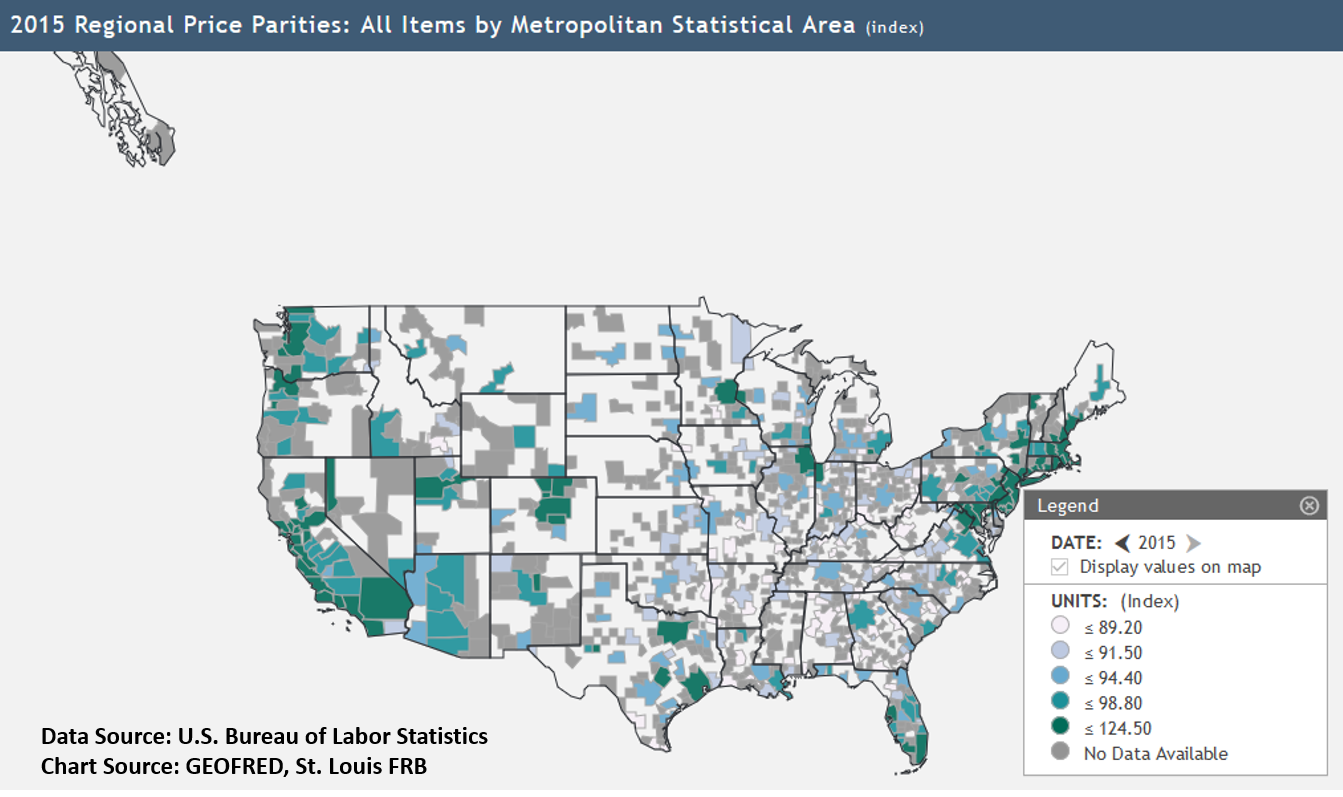 These stark product and geographic differences create a central bank’s “inflation trap” – distortions and inequities of inflation-targeting that have increased since the 1980s. This is simply because price level increase isn’t felt equally by people because it depends on what a person buys. And, prices of what they buy are influenced by real estate costs paid by sellers of products.
Measurement complications: price level increases might be less
- Longstanding “quality” adjustment debate for goods, especially durables and services such as health care, points to lower prices
- Digital data from analytics groups at Adobe and Amazon illustrate lower price growth. Recently, research from Austan Goolsbee (Chicago) and Peter Klenow (Stanford) using data from Adobe Analytics found online price level increase was about 1% lower than in the Consumer Price Index (CPI) for the same categories from 2014–2017. The increased variety sold online implies an additional 90-150 basis points lower price level increase than in the matched model/CPI-style indices. And, CPI runs higher than the PCE deflator.
Implications for people:
- “Inflation” is personal – people feel price changes based on what and where they buy. Avoiding price increases is about shifting to lower cost locations, sellers, and products. For example, comparing the 2016 trend to the 2009 trend, for lower prices, eat more Cereals, Processed fruits and vegetables, and Fresh milk. Eat fewer eggs and use apps like GasBuddy. Online shopping finds prices that are lower and often are not based on location.
- Invest with funds flow – follow the money. Since the late-1980s with increasingly globalized financial markets, and especially since 2009 with the Federal Reserve’s large-scale asset purchases (commonly “quantitative easing” or “QE”) a winning approach has been to follow the funds flow, primarily QE bubbling the public equity markets, with more injections from household savings and “rest of the world.” With large investors cautious of the size of the public equity bubble, funds are flowing into private equity and, more recently, direct investments in operating companies to avoid the private equity firm fees. Importantly, typical risk metrics can mislead because they were not designed for an era where funds flow dominates.
Implications for policy:
- Compared to before 1981, price level change reported by statistical agencies cannot be assumed as primarily monetary-driven “inflation.” Price level change from non-monetary causes has increased.
- To guide monetary policy, a method is needed to separate monetary from non-monetary causes of price level change
- Product price increases for non-monetary reasons, such as egg prices rising with fresh milk falling, are beyond the capability of the Fed’s “blunt instrument” tools
- With price level change lower, real interest rates are higher. In the U.S., this means that the assumption of a roughly 0.25% negative real Federal Funds (FF) rate would be a roughly 1% positive real FF rate.
To learn more about how to apply these insights to your professional portfolio, business or policy initiative, contact “editor” at this URL.
Data Geek Note: In the bubble chart, fluctuations are hidden in annual averages. Yet, this rough approach visually flags recent changes and lack of widespread price increases.