Weaker labor productivity isn’t widespread or always bad. The more policy-makers are guided by productivity, the more investors need to understand what’s really happening.
Reveals are famously done by drawing back a curtain. Curtains are made in the textile industry that includes apparel. Apparel labor productivity categories for the period 2009 to 2016 varied widely – from one falling 15% to another rising 25%.
In “Labor productivity gets trumped by ROI,” we described how business investment decisions are guided by financial returns more than how economists measure labor productivity. This means flat or falling labor productivity due to increased hours worked might be acceptable to business decision-makers seeking higher asset utilization or returns to investors. Investors expect higher returns and don’t even have the data to calculate labor productivity.
Our reveal here is that business dynamics lead to different business models and outcomes that roll-up into industry labor productivity measures that vary widely.
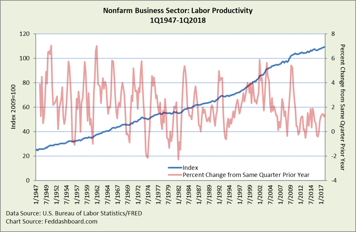
To set the stage, this is the typical “scary chart” of labor productivity, with weakness since the 2010 peak that reflected mass firings of workers.
 This aggregate average view hides the reality of real businesses and people.
Previously, we revealed how much was hidden by this ratio (output divided by hours worked) when we directly plotted output and labor hours in “Another theory goes “poof” – labor doesn’t limit growth like it used to.” There, a new story emerged of the labor productivity trend of past decades compared to downturn rebounds.
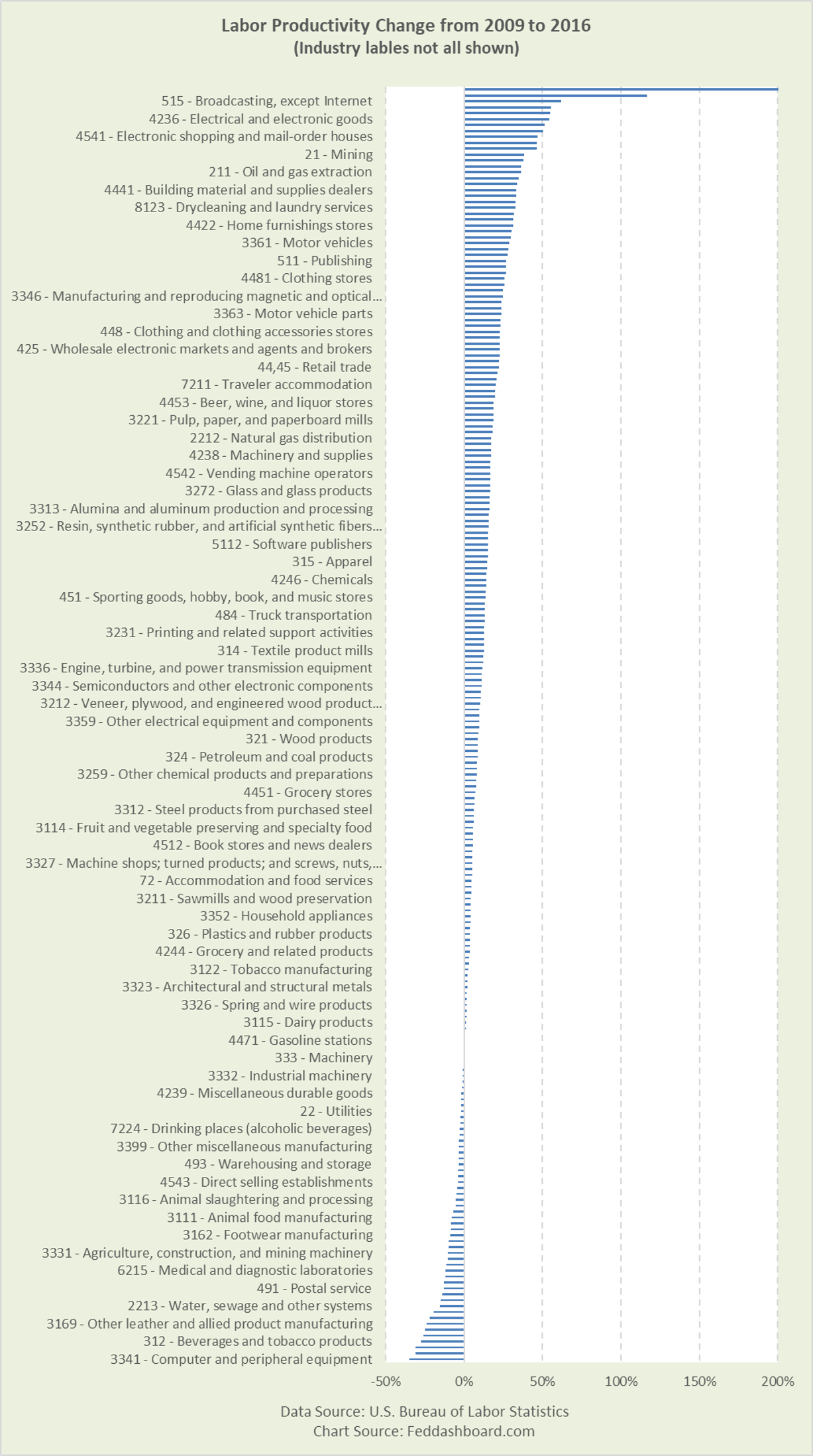
Below are industries. This view zooms in on the post-crash period that is most discussed, with 2016 the latest year with the most data released.
The data show diversity — not generalized weakness. The picture reflects individual industry dynamics, including:
- Lower labor productivity is acceptable to achieve financial performance measures
- Offshoring where the labor productivity of the entire value chain is not counted in U.S. measures. For example, labor-intensive tasks in the U.S. for some industries, such as design, final assembly, or customizing, tend to lower U.S. labor productivity.
- Industry restructurings
- Industry outsourcing that shifts labor from goods to services industries
- Labor hour bounce-backs after mass layoffs
 Note: All released data bars are shown, but some data labels aren’t shown due to chart format limitations.
- Five strongest increases were: Wireless telecommunications carriers (except satellite), Cable and subscription programming, Motor vehicles and parts, Textile and fabric finishing and fabric coating mills, and Electrical and electronic goods
- Five largest decreases were: Computer and peripheral equipment, Support activities for mining, Other transportation equipment, Beverages, and Other leather and allied product manufacturing
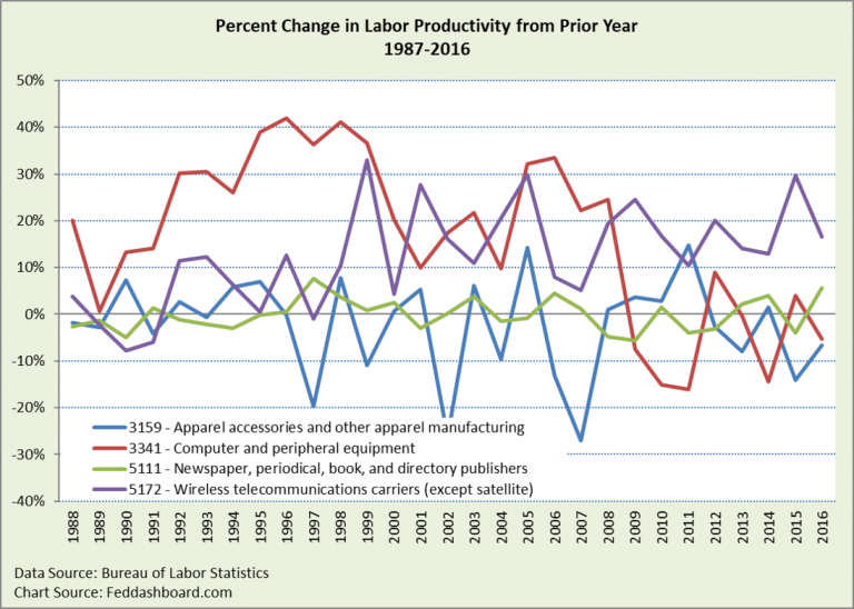
Trends aren’t steady. Looking at trends since 1987, Textiles is just above the middle of the pack, and Computer and peripheral equipment is #1. Below are examples of pattern differences.
 Again, the point is diversity and volatility in productivity trends reflecting business dynamics and decisions. This is far from the plodding aggregate average view of the Nonfarm Business Sector.
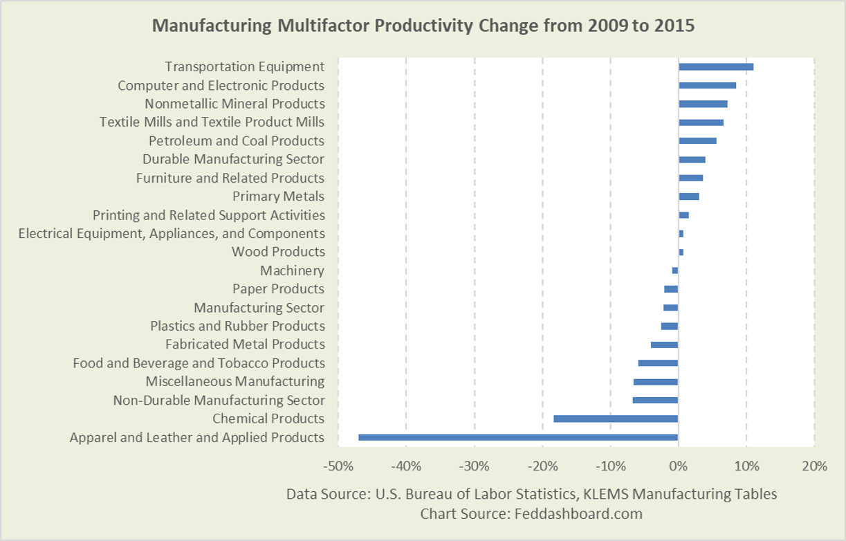
Switching to manufacturing Multifactor Productivity (MFP) paints a similar picture of diversity reflecting differences in business dynamics and decisions.
 As its name implies, MFP seeks to include all inputs to production, not just labor. For example, we illustrated with the chemical industry in “Henry Ford & the plumber — stopping the productivity panic.” The residual of output growth beyond input growth is deemed to be productivity growth.
In summary:
- In the data, weaker labor productivity isn’t uniform or widespread
- In “Labor productivity gets trumped by ROI,” lower labor productivity is acceptable if it’s a side-effect of higher-priority financial performance objectives
- In “Another theory goes “poof” – labor doesn’t limit growth like it used to,” improvements in technology and management technique mean that economic growth isn’t as limited by labor as it once was
To learn more about how to apply these insights to your professional portfolio, business or policy initiative, contact “editor” at this URL.
Data Geek Notes:
- The Bureau of Labor Statistics (BLS) doesn’t publish detailed data on all industries, thus the pictures above show what is available.
- Labor productivity data is for 2, 3, and 4-digit industries. MFP is for 3-digit manufacturing industries.
- The BLS publishes nonmanufacturing MFP estimates. Diversity is similar. From 2009-2015 for 3-digit industries, strongest increases were in Funds, Trusts, and Other Financial Vehicles (43%) and Real Estate (15%). Deepest decreases were in Securities, Commodity Contracts, and Investments (-11%) and Mining, except Oil and Gas (-10%). The two primary outsourcing categories were up 2% and 2.6%.
- Productivity is calculated differently by industry, depending on source data. The BLS nicely describes this in the Handbook of Methods Chapter 11, in the “Methods and data sources” section starting on page 2.

