Productivity growth is stronger than the Fed believes. Thus, Fed communications are muddied and traders churn markets. This is ugly for investors. Investors can respond by using industry productivity data to both avoid churn and pick better stocks.
Measuring productivity is like measuring a basketball championship – it is complex and changing within the season and across years. It would be foolish to bet on this year’s outcome based only on last year’s winner.
In productivity, too many people feel overwhelmed by the richness of the data and cling to a single “headline” number. Yet that headline number is false security leading to poor decisions. In sharp contrast, data mavens more easily see structural changes, stronger productivity growth, and investment opportunities.
Low productivity is mostly a myth:
- Weak labor productivity growth is mostly due to the strength of hours worked in services industries and undercounting the quality (or price-performance) improvement of major sector output.
- Weak multifactor productivity (MFP) growth is mostly due to increasing inputs; especially “intellectual property products” that were previously uncounted good management practices.
For investors:
- Fed leaders’ misunderstanding of productivity muddies communications and forecasts, and traders react by churning markets.
- Opportunity may well come from using what the Fed seems to overlook, industry-level productivity data.
Investors and businesses can explain to the Fed on how company managers think about productivity. Fed Vice Chair Stanley Fischer recently said, “Finally, and most important, weak productivity growth has likely pushed down interest rates both by lowering investment, as firms lower their expectations for the marginal return on investment, and by increasing saving…” His comment reflects what many economists think, that productivity is a cause. Yet, managers know that productivity is just an outcome measure.
Btw, Fischer is right that investment at many companies is falling, but the Fed also misunderstands the causes, as we’ve illustrated previously.
Company analysts have learned:
- Physical assets for production have been falling due to a combination of off-shoring, outsourcing, and more efficient “small footprint” manufacturing. Small footprint manufacturing is occurring for a range of reasons including management technique (e.g., Deming methods as were first applied in Japan), equipment design and natural environment considerations.
- Business actions to achieve objectives vary widely – even in the same industry. To improve quality, lower cost, gain flexibility or boost sales, companies vary in how they add people, improve management methods, and invest in physical capital.
Fundamental investors dig beyond earnings per share to find causes in company financial statements and drivers for those numbers in tangible business conditions and actions. Fed leaders could do the same by reading the details of company filings with the Securities and Exchange Commission and the U.S. Bureau of Labor Statistics (BLS) detailed data.
To spot trends and benchmark company performance, BLS industry productivity data is very helpful.
The BLS publishes a variety of productivity measures. The BLS number crunchers are careful to state that their calculations only reflect the variables used. The BLS calculates:
- Two measures: Labor productivity (roughly output divided by hours worked), and Multifactor productivity (roughly output divided by hours, plus measures of physical capital used, energy, materials and purchased services).
- Two ways of aggregating: “Major sectors” (e.g., business, nonfarm business) and industries (with greater detail for manufacturing industries). Importantly, the measure of output is different at different levels of detail. For business sector, output is what is left over after subtracting out government and households from Gross Domestic Product (GDP). For manufacturing industries, it is more tangible – shipments reported by companies to the U.S. Census Bureau. The BLS helpfully documents many other nuances.
In summary:
- The Fed’s misunderstanding productivity has cascaded into delayed interest rate decisions and market churn.
- The Fed – because of these structural changes – can lower the weight of productivity in its interest rate decisions.
- The BLS can accelerate improvements to methods for price-performance (“quality”) adjustments of products and fixed investment.
- Investors can respond by both educating the Fed and using industry productivity data for smarter stock-picking.
If you are an investor who wants to learn more about how productivity numbers work to pick better stocks, then you can see our prior illustrations and our latest analysis right here…
Data Geek Bonus Feature:
Revealed — 3 insights hidden in productivity numbers
The story of disconnect between investors and the Fed begins because the Fed uses the term “productivity” differently from investors. Investors and people in general think of productivity as, “Work smarter, not harder” as Henry Ford said. We tell this to our children on sports teams and to our investment portfolio teams. In companies, labor productivity is measured with cost accounting; the number of products shipped is divided by production wages or hours worked. A broader measure of productivity is units sold divided by cost of goods sold.
By contrast, economists get into trouble when they excessively aggregate.
Let’s look at three examples of excessive aggregation and how averages hide answers…
- Broad productivity averages hide differences in types and measurement of output
Productivity compares outputs to inputs. Inputs can be just labor hours worked or also include physical capital, energy, materials and purchased services. Each input can be adjusted for different factors (such as worker skill). There are many productivity measures, each with a formula limited in explanatory power by the variables included, dependent on data quality and subject to interpretation error.
Differences in measures start with the definition of output. Output can vary by sector/industry (such as business, nonfarm business, or specific industries) or output type (broad value-added including Gross Private Domestic Investment (GPDI) or actual products shipped). GPDI includes investment in equipment, structures, and intellectual property.
The broadest measures (termed “Major Sector”) include both regular business production and GPDI. For example, Business Gross Value Added (GVA) (a.k.a. Business Gross Domestic Product (GDP)). The problem is apples-and-oranges — mixing current production and investment in future productive capacity. It is not cost accounting or common usage.
As you might guess, the ratio of GPDI to total Business GVA (blue line) varies over time. From 3Q2009 to 1Q2015 GPDI had been increasing compared to BGVA, and then it fell.
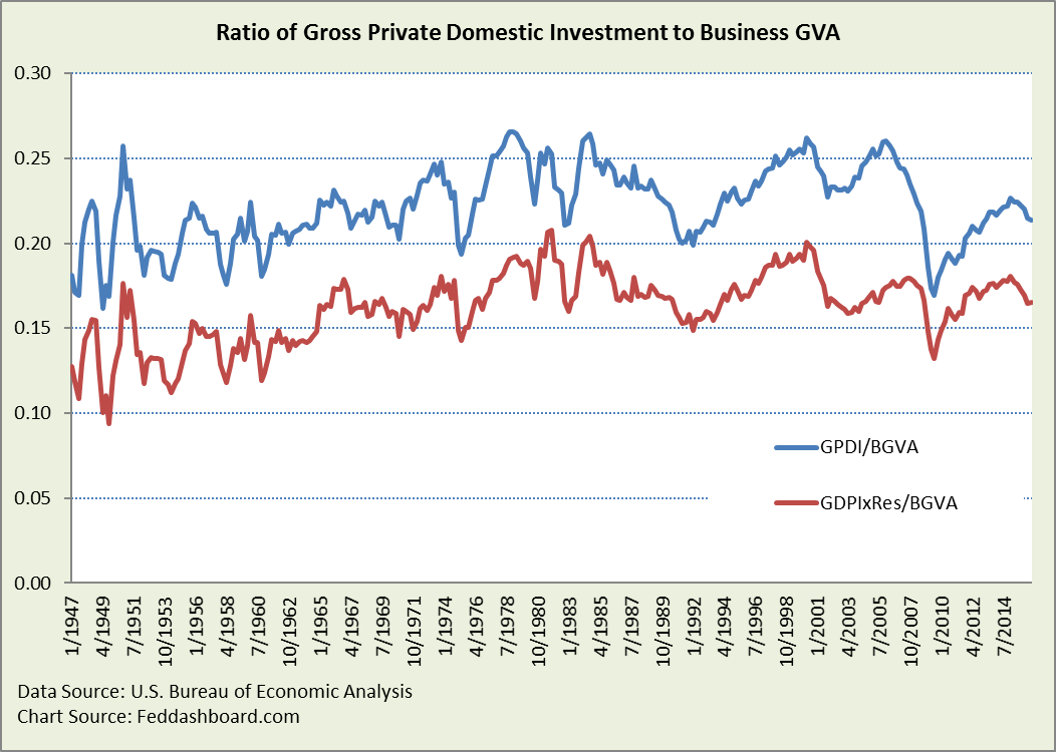 Much of the lower growth in GPDI since 1Q2015 is explained by lower growth in residential structures and fall in oil & gas equipment. The red line shows a narrower business investment portion of GPDI, excluding residential structures.
If someone wishes to use a measure of productivity that includes investment, then they should know that real investment in equipment is understated. This is because price indices for equipment haven’t been sufficiently adjusted for performance or quality improvements in that equipment. (In econ-speak, these are “hedonic” adjustments, from the Greek word for “delight” or “pleasure.” These adjustments to products reflect the benefits of new features.)
Consider comparative data. The price index for equipment fell by just over 20% from 1995 to 2001 and has been roughly flat since. By contrast, the price index for consumer durables fell continuously by 35% and the fall was probably greater because the adjustments lag new product introductions. The case that real GPDI is higher because the quality (price-performance) of that investment has improved is also supported by industry data on business equipment price-performance, cost savings expected by purchasers and examples such as rapid quality improvements in oil & gas. Good news is that both BLS and Bureau of Economic Analysis continually make improvements.
Because aggregates hide variations, productivity matters much more in specific than in general – especially to investors in companies.
Of course, for investors, persistent variation is good because it means stock-pickers can outperform.
The BLS knows details matter, so they publish details for manufacturing industries where output follows the common usage of product shipments. More on this below.
- Broad averages hide diversity in hours worked
As we’ve shown previously in, “Productivity Puzzle explained – discover what happens when trends collide,” Labor Productivity has been slower because hours worked – bouncing back from 2009 – have grown faster than output.
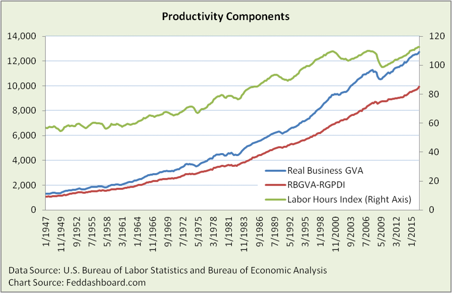 In the regular production output measure (red line), notice the upturn since 1Q2014 – good news. Stronger productivity is mostly due to the fall in structures and equipment since 2014, nontrivially due to oil & gas industry collapse. The slowing of Labor Hours Index growth (green line) is good for measured productivity, but bad for people wanting to work more hours.
Where have labor hours most grown? In the Services sector. But, Services as an aggregate average hides answers. To the rescue, comes the BLS with its industry data. For Labor Productivity, total hours worked is the input. For Multifactor Productivity (MFP), the cost (price times quantity) of labor is used. Both show diversity. The cost view is more helpful to investors because it is more similar to wages on financial statements.
Services growth rates are 1987-2014. For reference in reading the chart, 4.5% (2% inflation + 2.5% real growth) annually compounded growth is about 230%, almost all services labor costs have been growing briskly – good for people working but bad for measured productivity.
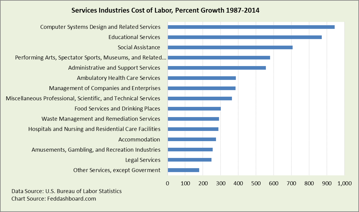 Other non-manufacturing industries with stunning growth in labor costs (again, price times quantity) are:
- Funds, Trusts and Other Financial Vehicles, up 1570%
- Support activities for mining, up 1090%
- Data processing, internet publishing, and other information services, up 610%
- Securities, Commodity Contracts, and Investments, up 460%
Helpfully, BLS cautions “Output and the corresponding inputs for nonmanufacturing industries are often difficult to measure and can produce productivity measures of inconsistent quality. Customers should be cautious when interpreting the data.” The more our economy shifts toward services, the more difficult productivity becomes to measure, and the more likely productivity growth from improving technology is missed.
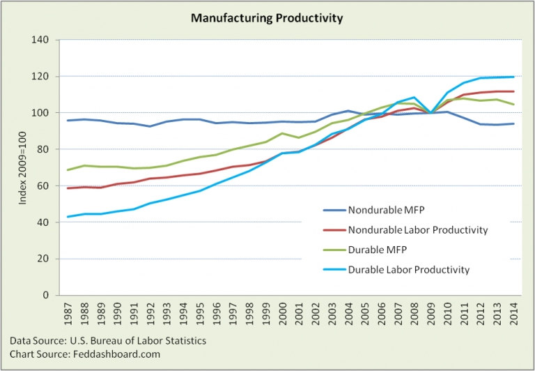
In industry-level productivity, the output measure is different. Output is based on product shipments as reported to the U.S. Census Bureau. Let’s look at Labor and Multifactor Productivity (MFP) for durables and nondurables…
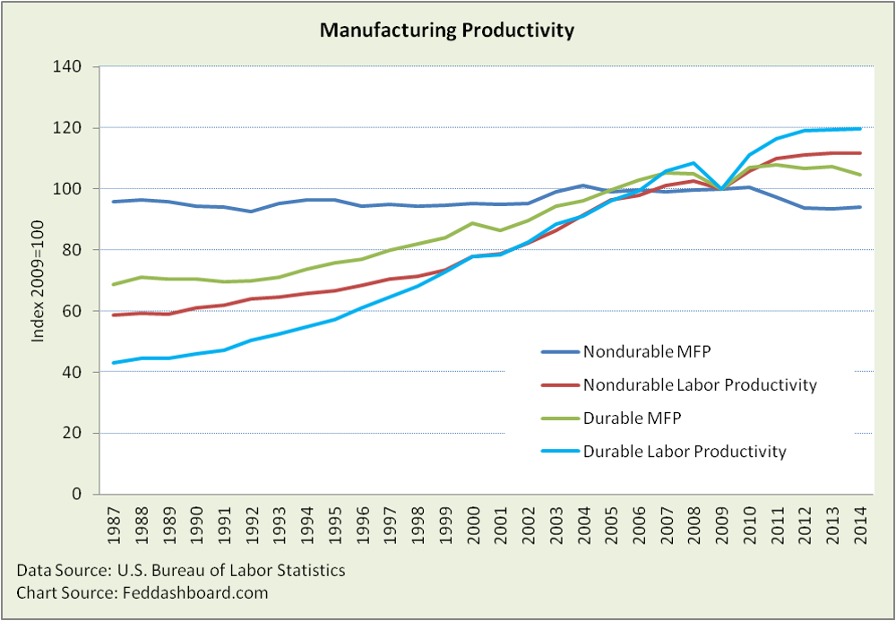 Durables Labor Productivity has consistently improved. By contrast, Nondurables MFP has long stagnated; it dipped in 2009 without recovering.
What combination of output and inputs produced these trends?
In durables, stronger labor productivity resulted from less labor was used.
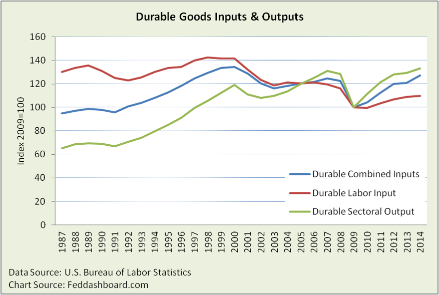 Stronger labor productivity would be more welcome if output was also higher, but output didn’t reach its 2007 levels until 2014. Again, improved quality adjustments to products would increase output.
In nondurables, as the Labor input fell from 1999-2009, Labor productivity grew. More recently it has been flat. As other inputs grew, MFP has fallen.
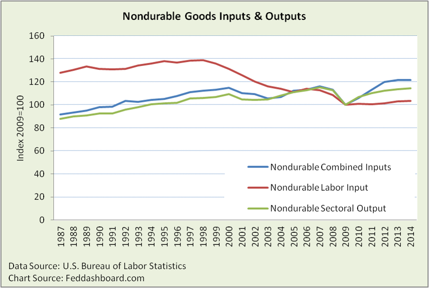 Nondurables demand – and thus output – is highly related to population. As we’ve illustrated previously with consumption data, per person consumption of food or socks is difficult to grow.
- Broad averages hide diversity in asset use
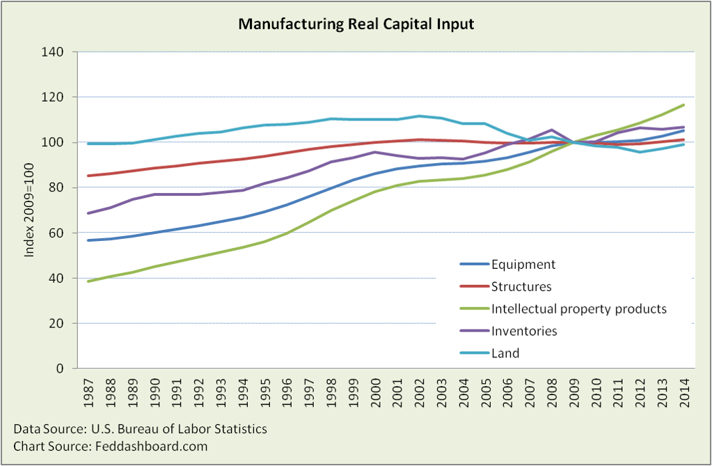
To understand manufacturing, a big story is in capital. Recall, increases in inputs decrease MFP.
Hours worked is relatively clear from employer surveys. However, the measurement and math of the other inputs become dicey (especially around “soft” capital such as intellectual property) and intertwined with other changes (such as imported services or outsourcing).
Looking at the manufacturing sector, Land and Structures have been less demanded since about 2000. When these first lowered, they were a boost to MFP. With the slight upturn starting 2013, they hurt MFP. The strongest consistent increase is Intellectual property products (IPP, such as software and research and development). By increasing most as an input, IPP is the biggest penalty to MFP growth.
 We previously illustrated capital change specifics for the chemical products industry in “Henry Ford and the Plumber.”
The tech and trade transformation created a new world for productivity watchers
- When resources were scarce and post-WWII demand was hot increased productivity was needed to boost goods production.
- Today, capacity abounds and goods are abundant. Higher productivity isn’t needed to overcome scarcity, other than in commodities such as oil & gas that is undergoing a transformation like farming did in past decades.
- Consider a restaurant that automates with robots for stationary tasks. People are eliminated, labor productivity jumps and MFP is roughly the same. The classic labor economist response is that wages should rise because the people who are still working must be smarter/faster aided by robots. Today, not necessarily true. People still working might only be “arms and legs” to aid stationary robots, waiting to be replaced by mobile robots. The same goes for “knowledge workers” waiting to be replaced by machine learning.
- So be careful about what you wish. Higher labor productivity means fewer hours worked and possibly lower skill jobs. Labor productivity doesn’t have the same policy implications it once did. Labor productivity is less central to policy until resources (especially commodities) become scarce, domestic buyers deleverage or exports dramatically grow (when peace and rule of law grow around the globe).
For investors, to wrap-up this bonus section:
- BLS manufacturing industry data is helpful because it is based on shipments – not broader value added that includes gross investment. Shipments are closer to the widespread view of productivity that Henry Ford described as “Work smarter, not harder,” and a fundamental analysis and cost accounting view of productivity as shipments relative to Cost of Goods Sold (COGS).
- Shipments, COGS or unit costs data reported by companies can be compared to industry trends in the BLS data. For companies that don’t report for competitive reasons, BLS data can help investors prioritize industries and ask better questions.
Bottom line: Broad aggregate productivity averages hide answers.
- Aggregates shouldn’t matter to policy-makers because better policy comes from detailed insight. Worse, monetary policy made (or even hinted at in speeches) has churned markets.
- Aggregates shouldn’t matter to investors because broad averages lack the detail of industry measures.
- What helps pick better stocks is company analysis enlightened with BLS industry data.
To learn how to apply these insights to your professional portfolio, business or policy initiative, contact “editor” at this URL.
Data Geek Notes:
This and our other Fed Dashboard & Fundamentals analyses of productivity highlight just a fraction of the long-discussed questions about productivity
- A helpful academic summary of conditions is in What does Total Factor Productivity Measure, by Richard Lipsey and Kenneth Carlaw
- The BLS provides multiple clarifications and cautions on their labor productivity and MFP web pages
BLS data is calculated with economic accounting whereas companies report on Generally Accepted Accounting Principles.

