23 April 2014
People on Main Street and town squares have long felt the official (also termed “U3”) unemployment rate hides important information about job quality, how long people have been unemployed, job security, openings, pace of hiring and quits, and level of wages paid. And, people feel how this hides what they personally face in their industry, location and personal characteristics such as age and education.
While many policy-makers feel that U3 is still the best overall measure of unemployment, this too is being questioned because of U3’s difficulty tracking directly to:
• Broader group of employed people needing more work
• Real wages in paychecks
If U3 isn’t moving in step with other measures, then U3’s overall value breaks down.
Wall Street traders are increasingly looking at broader measures because the Federal Open Market Committee (FOMC) has increasingly highlighted broader measures. Yet, many people have long known the FOMC examines multiple labor market measures in the Staff Review of the Economic Review section of FOMC Meeting Minutes. These measures have also been highlighted in our past commentaries and Economic Picture Book.
With the CAUTION that any summary measure hides useful detail, consider these:
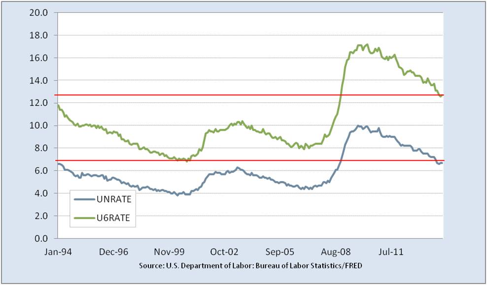
U6 Rate — Total unemployed, plus all persons marginally attached to the labor force, plus total employed part time for economic reasons, as a percent of the civilian labor force plus all persons marginally attached to the labor force. Looking back to 1994 when U6 was created, the picture reveals decades of disillusioned workers who have never experienced such high employment.
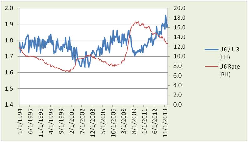
How well does U3 track U6?
Clearly:
• U3 hasn’t consistently tracked U6 since about December 2000, thus lost some of its “overall measure” value.
• Spread of U6 to U3 is at an all-time high.
Caution:
Comparison to U6 rate illustrates this is not a simplistic cyclical relationship – causal drivers vary since 1994 when U6 was created.
From a relationship perspective:
- Current period is most similar to 2003-2006 when it portended a crash.
- Today U6 rate is nearly 50% higher than 2006, economy weaker and consumer-driven credit bubble replaced with FOMC-driven stock market and home price bubble.
- New situation in recorded history
- Watch for warning signs when a relationship is unclear
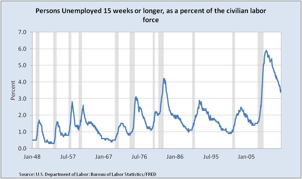
U1 Rate – Persons unemployed 15 weeks or longer
This measure, counting unemployed as in the U3 rate, shows a downward slide now finally below 1983 peak.
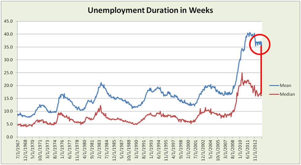
Yet, 15 week measure hides the magnitude and length of unemployment. Mean and median measures (which still hide detail), uncover a labor market in far more distress than the 1983 prior peak – with a mean (average) more than double the 15 weeks that is often considered long term. Further, the mean of about 2x the median (half of people more and less than that median point) illustrates a significant group of far longer unemployed.
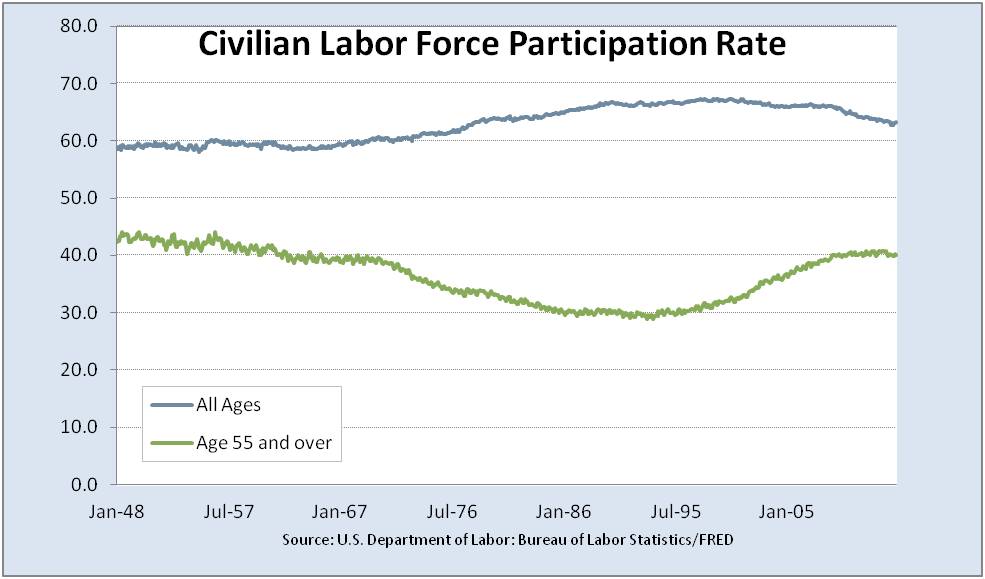
Civilian Labor Force Participation Rate
Labor force as a percent of the civilian noninstitutional population zooms into view when discussing whether the drop in U3 (unemployed divided by Civilian Labor Force) is being distorted because the Civilian Labor Force is shrinking. Peering into this asks, “Why?” A debate springs-up about whether this is due to an aging population. If older workers are voluntarily dropping out, then no policy action is needed. If that is not the case, then policy might help.
Job change rates
Stabilizing, but more room for growth is the picture. Good news that layoffs are down, openings are well up, more confident workers willing to quit, and hires stable. Yet, rates are not quite to the level of the 2003-2005 recovery. However, with a short time series, “normal” is less clear.
Real Wages and Salaries per Person
Each additional person working to any extent is good. Next need is job quality (in terms of total hours, skill level, permanence and wages). Quality is repeatedly raised – a job in hospitality does not equal a job in high-skill manufacturing. A job lost in a long term care facility is not fully recovered by a home health care worker.
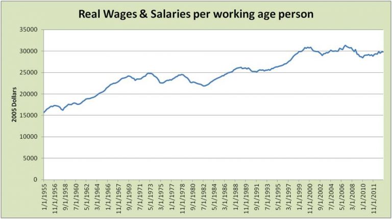
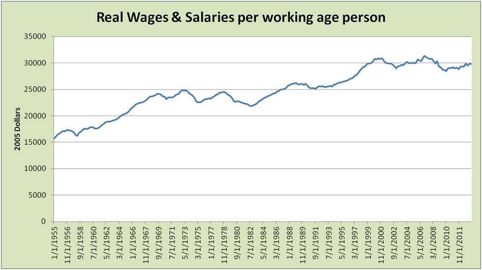
Many wage questions can be answered in the picture of Real Wages and Salaries per working age person (adjusting for inflation with Consumer Price Index for All Urban Consumers). It’s personal. It touches people’s paychecks. This view reveals people on another plateau since 1999, modestly growing from 2010 back up to 1999 levels.
In economic health terms, Real Wages & Salaries is powerful (as opposed to employment counts, or hourly or weekly earnings) in total because it reflects much consumption that feeds business sales. This measure is particularly important today because U3 rate and real wages and salaries per person don’t directly track. Today’s tracking behavior has not been seen since the 1950s. More in a future post.
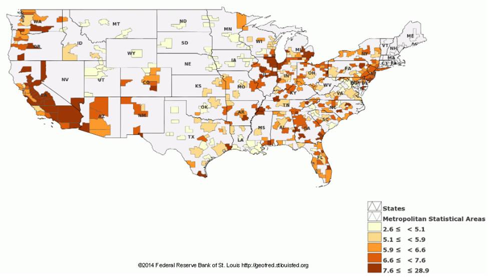
Lastly, a final encouragement to dig into the details behind averages – consider U3 by MSA.
More variation by job type, education, demographics and more.
Looking for the definition of a term in this article? BLS Glossary is your first place to start www.bls.gov/bls/glossary.htm

