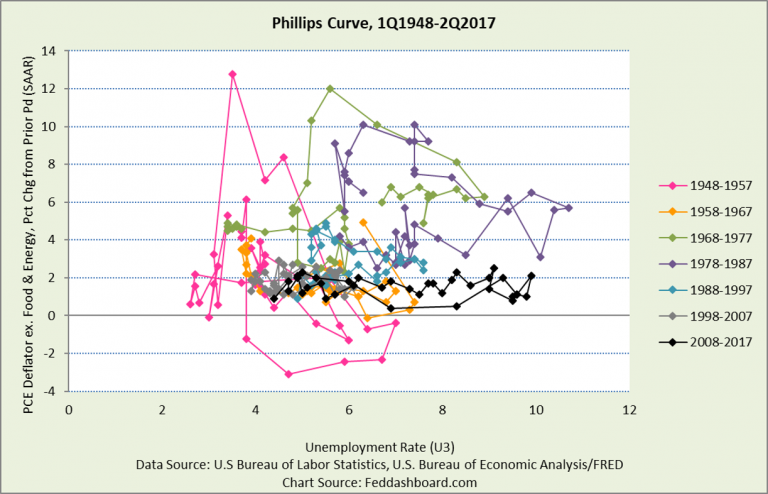
The Fed looks to the official unemployment rate to indicate future inflation. But, that relationship – the “Phillips Curve” — hasn’t worked well for decades because:
- The official unemployment rate has been an increasingly poor reflection of available productive capacity (“slack”)
- Price moves are more about cost and competition, influenced by government regulatory and fiscal policy, than by monetary policy
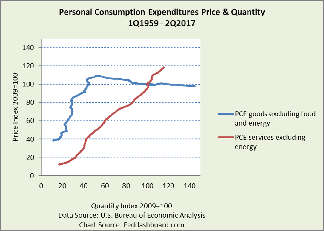
- Average price for all goods has been falling for the past two decades – diverging from labor-intensive services – a dramatic change in our economy
Bill Phillips wanted to understand how the economy works. He was born in New Zealand in 1914, watched his father build a small steam-powered hydro-electric plant, trained as an electrician and had an adventurous spirit. After WWII, he moved to London and trained as an economist. His passions came together by creating a model of our economy brought alive by water flowing through tubes and valves. A few of his machines survive, as in this video.
Phillips penned a 1958 paper on UK unemployment and money wage rates from 1861-1957. Other economists expanded his work using data from other countries, switching to average consumer price increase from money wage rates in 1960, calling it the “Phillips Curve,” adding “inflation expectations” and more.
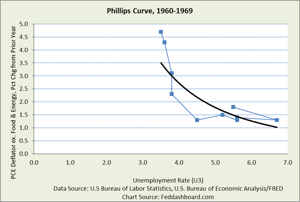
The 1960s heralded the longest pristine period of the Phillips Curve, shown below with its power curve. Over time, the Phillips Curve became a bedrock of central banking, using unemployment rate to forecast “inflation” to guide monetary policy.
 Yet, since 1970, the curve has struggled to hold a pattern as seen in a basic flavor of the Phillips Curve below.
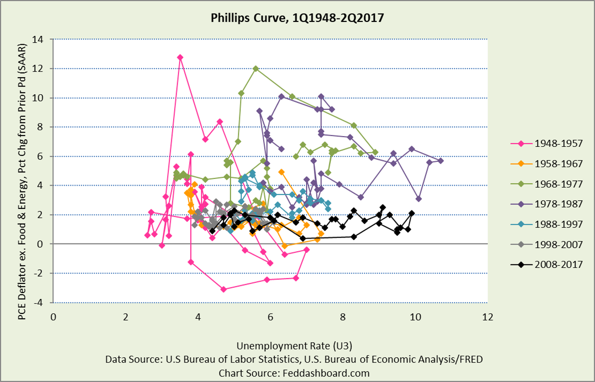 Today, economists puzzle over whether the curve has gone “flat” (data points don’t move vertically when they move horizontally) meaning that changes in unemployment don’t lead to changes in average price levels (“inflation”).
Four changes explain why unemployment has been a poor predictor
First, the official unemployment rate (labeled U-3 by the U.S. Bureau of Labor Statistics) is an increasingly poor proxy for available labor capacity (“slack”). There are better measures.
- Broader measures include U-6, “total unemployed, plus all marginally attached workers, plus total employed part time for economic reasons, as a percent of the civilian labor force plus all marginally attached workers.” U-6 relative to U-3 has been historically high since late 2012.
- Hours available gives more insight to available labor capacity. People are counted employed if they did any work at all for pay or profit during the survey reference week, so 1 hour is the same as 60+ hours – misses much. The problem for the curve is that available labor hours don’t closely track the U-3 unemployment rate. Hours worked 2Q2017 are about 16.5% lower than at the same U-3 rate 2Q1955.
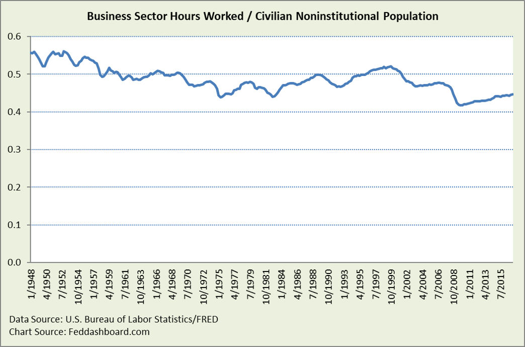 Second, labor slack is a poor proxy for total slack that also includes buildings and equipment. Labor inputs to production have been falling for decades, especially for goods and digital services.
- When Bill Phillips’ original use of money wage rate (labor price) was switched to the average of all consumer prices in 1960, labor slack could have been switched to total slack. But, it wasn’t.
- Even if wages were going up, this doesn’t lead to higher product prices because the proportion of labor in a product is falling.
- For manufacturing, labor factor share has fallen 30% from 1987-2015 (most recent reported)
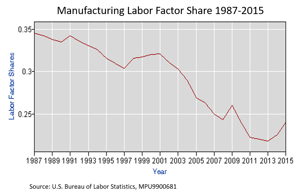 Note: Labor share of the inputs pie increased in 2014-15 mostly because materials and energy inputs decreased. In absolute terms, labor fell. Real labor cost fell over 10% from 1987 to 2015.
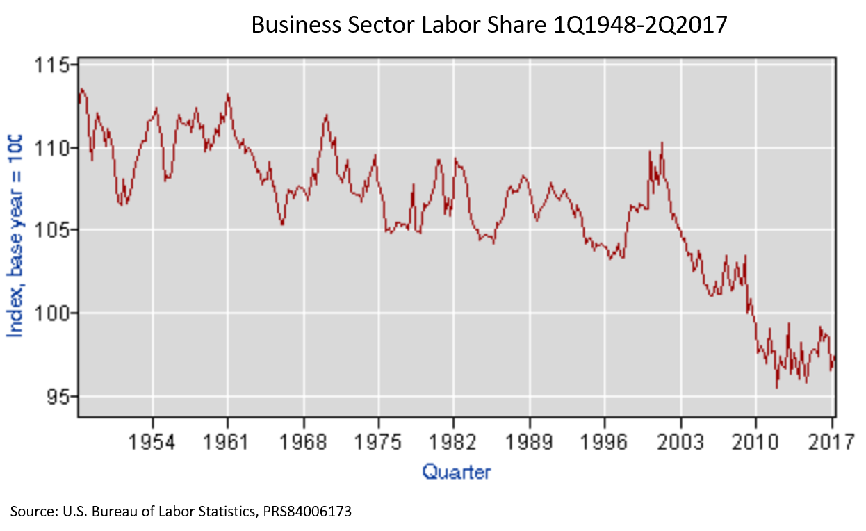
- Zooming out to the Business Sector view, labor share fell about 12% from its most recent peak in 1Q2001. Yet, that peak was a confluence of the tech bubble, beginning of the housing bubble and demographics. Looking back there has been a downtrend since 1961.
 Third, labor slack doesn’t have the same implications today because increasing automation doesn’t necessarily increase worker wages. Automation is more likely to increase wages if automation assists workers, such as some “knowledge work” roles. But, it’s different when workers assist automation. For example, wages are limited for people pushing powered parts carts to service robots by robot’s falling costs and increasing mobility.
Fourth, total slack is greater than typically estimated, as we described previously in “Slack Attack.”
- Productivity of buildings has grown 55% since 1987. Capacity in equipment and intellectual property is robust, easier to see in business than in economic data.
- Two capacity categories bear on U.S. prices but aren’t counted: 1) global capacity and 2) digital production, including much additive manufacturing (“3D printing”)
“Inflation expectations” misses shopping reality
Adding “inflation expectations” to the Phillips Curve equation doesn’t fix the problem because popular surveys don’t ask shoppers about their product mix.
- Thus, surveys are blind to how heavily a respondent spends on products on decreasing price trends (most all goods and scalable services) compared to products on increasing price trends (health care, housing, higher education, banking and most locally-provided and regulated services from accounting to nail salons).
- To illustrate, consider an average college student. Her tuition has been increasing significantly since the introduction of the new student loan program. But, her goods purchases, led by information products (tablet, camera, phone) have been falling in price and dramatically gaining functionality since the 1970s.
- Online shopping allows her to globally buy used textbooks or find the lowest price (with tax and shipping) for most any good. Sellers can’t tack-on “inflation expectations” because of the reality of an instantly searchable lower price from somewhere in the world with increasing cost-competition in shipping.
Using Treasury Inflation-Protected Securities (TIPS) doesn’t help because TIPS are a rather circular game of bond traders trying to guess what the FOMC will decide.
“Inflation” is a fuzzy target
Switching to the inflation axis of the curve, long-standing problems in monetary policy have become acute.
First, product price changes are less driven by monetary causes. “Inflation” is the weighted-average price change of a group of products. The huge assumptions are:
- The average nets out all the tangible cost and competitive causes for price moves, leaving mostly monetary causes (money supply, interest rate, and large-scale asset purchases/quantitative easing (QE)).
- Monetary causes are so large relative to other causes – and proportion stable over decades – that other causes can be deemed temporary or “noise.”
But, unless there are clear monetary drivers of individual product prices, then the overall average cannot magically create monetary drivers. In a world of:
- Electronic credit and payments — money supply doesn’t matter like it did when a banker brought bags of cash to a rural town and started lending. Financial companies have grown assets autonomously beyond the tangible sectors, as we’ve discussed previously.
- Global financial flows — interest rates don’t closely track the effective federal funds rate
- $3.6 trillion of Fed QE amidst global dilution, deleveraging (for a while) and demographics — inflation didn’t rocket, other than housing prices fueled by mortgage-backed securities purchases
Instead:
- Sellers set prices for cost and competitive reasons, heavily influenced by government regulatory, tax and subsidy policy
- As “inflation” has fallen since 1981, so has the proportion of monetary causes to cost and competitive causes
Second, monetary policy can’t fix problems that aren’t monetary. It’s like hitting a hockey puck with a baseball bat – the puck will move, with lousy control.
- The Federal Open Market Committee’s (FOMC) #1 foe in their quest to raise prices has been the success of health care cost containment by significantly lowering price growth in the largest category of personal expenditures.
- By contrast, a government can quickly increase a price with a regulation restricting supply, raising costs or taxes, or cutting a subsidy.
Third, FOMC-driven “inflation” distorts product prices. It’s like speeding up on a blind curve – adds danger regardless of driver skill.
- Product price trends vary widely. As we’ve illustrated previously, the central tendency across product types has been deteriorating.
- The more a product is on a decreasing trend in cost and price, and is discretionary; the more shoppers will buy less when prices rise (stagflation) – such as consumer durables
- The more a product is on an increasing trend in cost and price (especially for regulatory and tax reasons), and is not discretionary; the more prices will rise without increase in purchases – such as medical (especially dental), higher education and banking services
- Misallocation and inequality increases in both situations as profits and wages flow to parties with regulatory or market power – as described in business as “profit pools,” value-chain management and “moats” (barriers to entry)
And then the world changed…
In 1995 the average of all goods dramatically pivoted from increasing cost and price to decreasing – new in history.
- As we’ve shown previously, the decreasing cost trend started in the early 1970s with information processing, then consumer electronics, and then tipped the average of all goods
- The fork between goods and services created a gap where the mean lies, but that mean has little meaning given distinct product types with specific, non-monetary price drivers
- This two-decade trend continues until something halts the tech and trade transformation, creates demand sufficient to overwhelm the “slack attack,” or a solar flare wipes out global electronics
 Risk is great
- Fearing inflation from low U-3, risks delays in normalizing the federal funds rate – and learning how well it ripples
- Excessive focus on an outdated version of the Phillips Curve, distracts from 1) the shift to decreasing-cost products, 2) lower neutral interest rates because less cash is needed to fund productive capacity and 3) the need for a rethink of monetary policy
- Using measures that embed outdated Phillips curves, such as Potential GDP, risks cascading errors
Bill Phillips died young at age 61 in 1975 – just after the early curve began deteriorating. With his mechanical curiosity and today’s superior data, would he have changed to a very different curve? You decide.
Editors Note: This exploration of central bank effectiveness continues with “Solved – the missing inflation mystery.”
To learn more about how to apply these insights to your professional portfolio, business or policy initiative, contact “editor” at this URL.
Notes:
- This article is indebted to and extends points two, three and eight of an excellent review of current thought about the Phillips Curve: Buiter, W., Rahbari, E., Jensen, K.D., Rojas, C., “Why do economists consistently over-predict inflation?” Citi Global Economics View, 2 August 2017. Available online with Citi View client login.
- The Phillips Curve historical twists and turns are discussed in Mitchell, W.F., “The origins of the Phillips Curve,” Centre of Full Employment and Equity, Working Paper 99-02, February 1999. and Gordon, R.J., “The History of the Phillips Curve: An American Perspective,” Keynote Address, ESAM 2008.
- Original paper: Phillips, A. W., 1958, “The relation between unemployment and the rate of change of money wage rates in the United Kingdom, 1861–1957,” Economica, Vol. 25, No. 100, November, pp. 283–299.

