
29 December 2014
The Red Dots bubble chart is insightful to track imports. Size is the story. Tracking size of change in imports helps explain:
- Moderating price pressures as discussed in Pig tails and price levels – a tale of inflation and you, December 2014.
- Restraining worker wages and hours worked as discussed in Y2K – when workers hit the wall, August 2014.
Darker red dots mark products with price decreases since 1995. Lighter red dots have had price increases less than 30% over the past 19 years, also less than the 44% of the Gross Domestic Product price deflator. The light red dot in the cluster is “Goods: Other.”
Imports with the lowest price increases are among the largest and/or fastest growing. This price force weighs on domestic product prices, wages and hours worked. This force reflects increased global skill and capacity. In a technology sense, much of it also reflects space-time compression – improved physical delivery of a good or service.
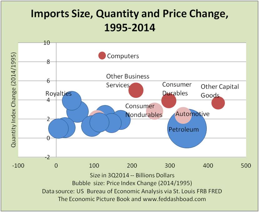 Why 1995? It was a turning point in technology history. Recall: cell phones were shrinking, personal internet mail was growing, and graphical user interfaces on computers attracted more people to the new “web.” In business, email was widespread; business automation software was starting to reshape tech companies and business outsourcing blossomed. More broadly, housing, telecom and .com bubbles all started.
Each chart bubble has its technology story. Royalties are increasingly tech-related, cars are becoming computers with wheels, and “Other” is often the cradle of tomorrow’s tech category. This is true whether the product: is technology, uses technology to project globally (outsourcing) or is produced with technology (robots, business automation software, additive/3D printing). Common to all industries is better and easier global communication due to the Internet.
Trend Tracking the Red Dots
Among the Red Dots, Other Business Services (OBS) growth has put pressure on domestic “good jobs.” In June 2014, the U.S. Bureau of Economic Analysis released new OBS product types.
As in Is this the Fed’s Inflation Trap? (August, 2014), change is tracked using scatter plots of quarterly quantity and price index estimates. By connecting each scatter plot dot (quarterly pair of data points), the picture tracks over time the intersection of supply and demand curves. Unless quantity is contracting, time moves from left to right.
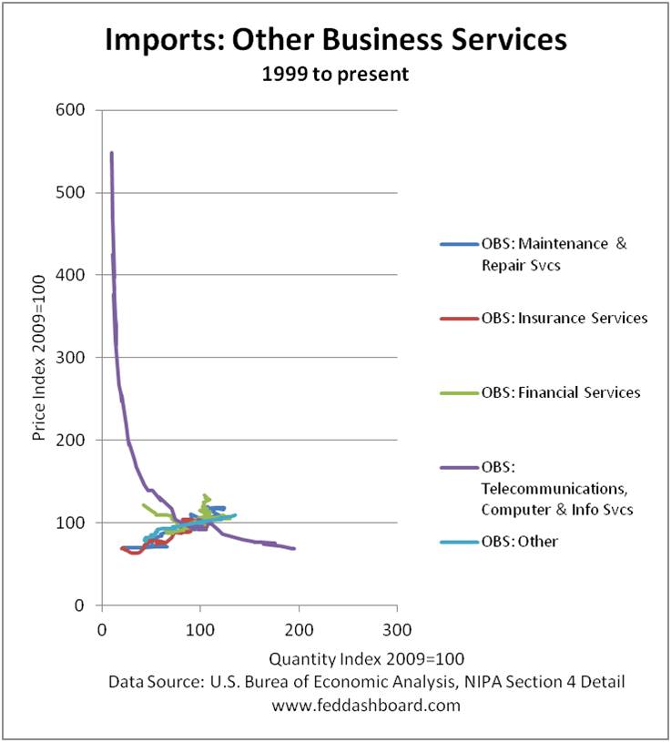 Within OBS, “Other” is about 48% of the total. The visual standout is Telecommunications, Computer and Information Services (16% of OBS) where prices plunge as output grows – opposite of other services.
OBS can be pictured along with other products influential for their size, or change in price or quantity. As quantity grew, prices plunged or flattened. These imports are sharply different from average domestic production (yellow line).
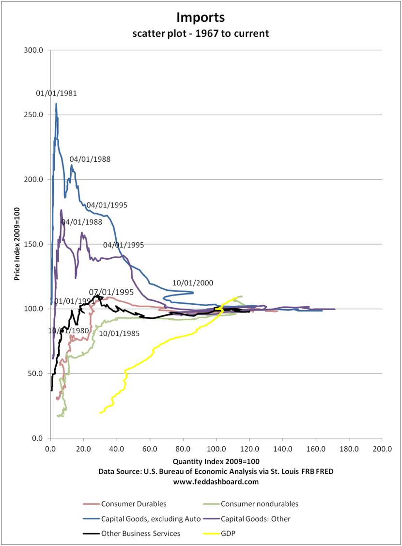 Note: In imports, Computers are not included as the large price plunge would make it difficult to see other products in the picture; overall Capital Goods excluding Automotive, category is included. Automotive is not included because volatility would obscure other lines.
A decade of imports visually slicing through the domestic production track illustrates problems and opportunities.
- Domestic companies can maintain price increases only as long as they enjoy: a) local cost advantages, b) regulatory protection or c) superior position in their value chain. This superior position is often created through agility in innovation, especially in differentiated products and/or services.
- Importers increasing prices (recently in Consumer Nondurables, but with quantity loss) gives domestic companies room to raise prices.
- In weighing problems and opportunities, we can look to data beyond the Red Dots to see that technology will continue to increase exponentially, global skill and capacity will increase, and nations will likely continue to lower trade barriers.
Insight
- For investors, determine the extent to which a company is expressly designed to defend and/or attack to sustain its value.
- For policy-makers, first, review regulatory and worker training policy to encourage companies to domestically-base their strongest value-drivers. Second, ensure trade policy reflects tomorrow’s technology reality, not past generalities.
The “peanut innovation economy” might be what we need. One hundred years ago, Alabama cotton crops were being devastated by the boll weevil. Farmers had nearly 20 years warning, but did little. Dr. George Washington Carver, a Tuskegee Institute scientist, tracked the advance, gave early warning and encouraged farmers to switch to sweet potatoes and peanuts. Saving the day, peanut products were ultimately exported and peanuts grown widely – typical trade. Yet, his most helpful lesson might be his pace of product design – over 300 peanut-based products from candy to soap to fuel to nitroglycerine. Historically, innovation creates the greatest sustainable value – what we most need today.