Central bankers fear slowing productivity growth. This fear comes from overlooking the details of productivity data. Like connecting dots, insufficient understanding leads to policy mistakes, distortions in markets, uncertainty for businesses, weakness in tangible markets and – through global financial flows – threatens financial stability.
Productivity is stronger than central bankers realize, both labor and multifactor productivity, as we’ve illustrated with multiple data pictures. For labor productivity, measured slower growth is primarily because:
- Hours worked rebounded strongly from lows of 2009 due to both rehiring and industry specifics such as oil & gas field built-outs
- Improvement in output quality has been understated
- Economists measure productivity differently from business people, leading to errors by central bankers in interpreting what they see in businesses.
In today’s analysis, the pattern in 250 dots illustrates what’s hidden by headlines.
Industry patterns vary dramatically
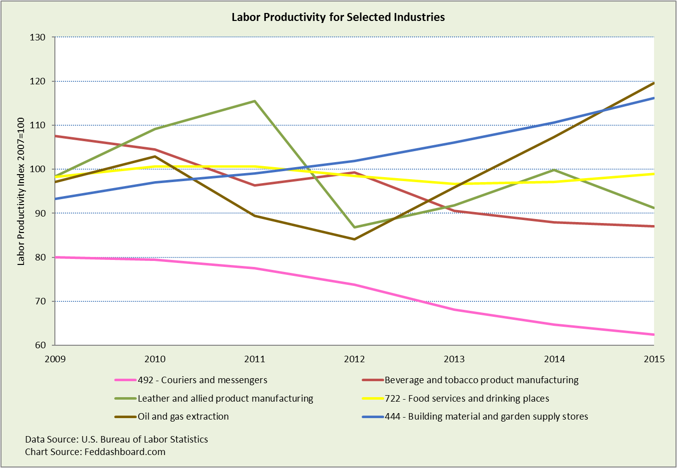
As the line graph shows, labor productivity of an industry can follow a relatively smooth path up or down, or swing widely. Investors know that each industry has a story — oil and gas was a drag on the “headline number” (usually non-farm business sector labor productivity) when oil fields were being built-out. Then development halted and the least productive rigs mothballed. Fewer hours worked relative to output increased measured labor productivity.
Productivity has improved in other industries as shoppers see in their local “big box” hardware and garden store. Both Home Depot and Lowe’s now feature customer service robots.
These industry specifics have an impact on, but remain hidden inside the “headline number.” As aggregate averages hide answers, investors will be burned if they fail to look beyond the headlines. Instead, investors selecting industries and companies can benefit from the specifics.
 Industry productivity varies dramatically
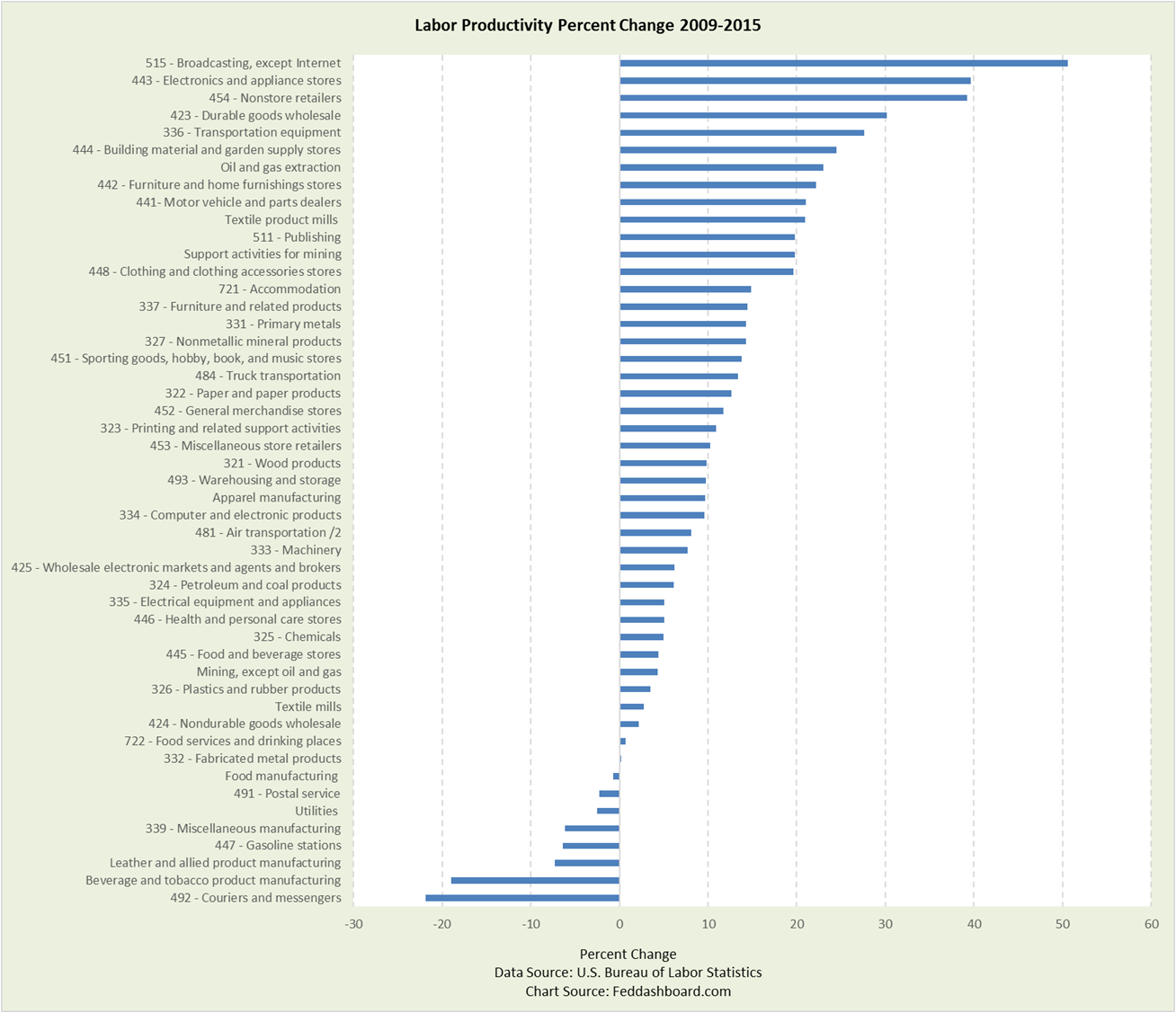
Now that it’s clear that changes in productivity in individual industries vary by year, the next picture zooms out to the percent change from 2009-2015 across about 50 industries. As 50 industries would have been too messy to show on a line graph, below they are shown on a bar chart.
This view shows a group of super-strong industries with cumulative labor productivity growth of 20%+ (over 4% average per year). Nearly half of industries beat a cumulative 10% and about 80% beat 5%. Of course, larger industries have more weight on the average.
 The story continues with more insights such as how:
- Rehiring in General Merchandise Stores and Air Transportation during 2009-2011 reduced 2009-2015 labor productivity. But, more people working additional hours isn’t bad.
- Value chain restructuring shifted both substantive productivity and accounting, especially if the outsourced activity then appears in another industry or country. Importantly, when an industry increases outsourcing of labor-intensive activities this tends to increase measured labor productivity. Multifactor productivity is theoretically neutral to outsourcing, but there are practical complications.
Worker rewards for productivity vary dramatically
“Work smarter, not harder,” as Henry Ford said, and automation should both mean higher wages because of labor productivity, but the reality varies widely.
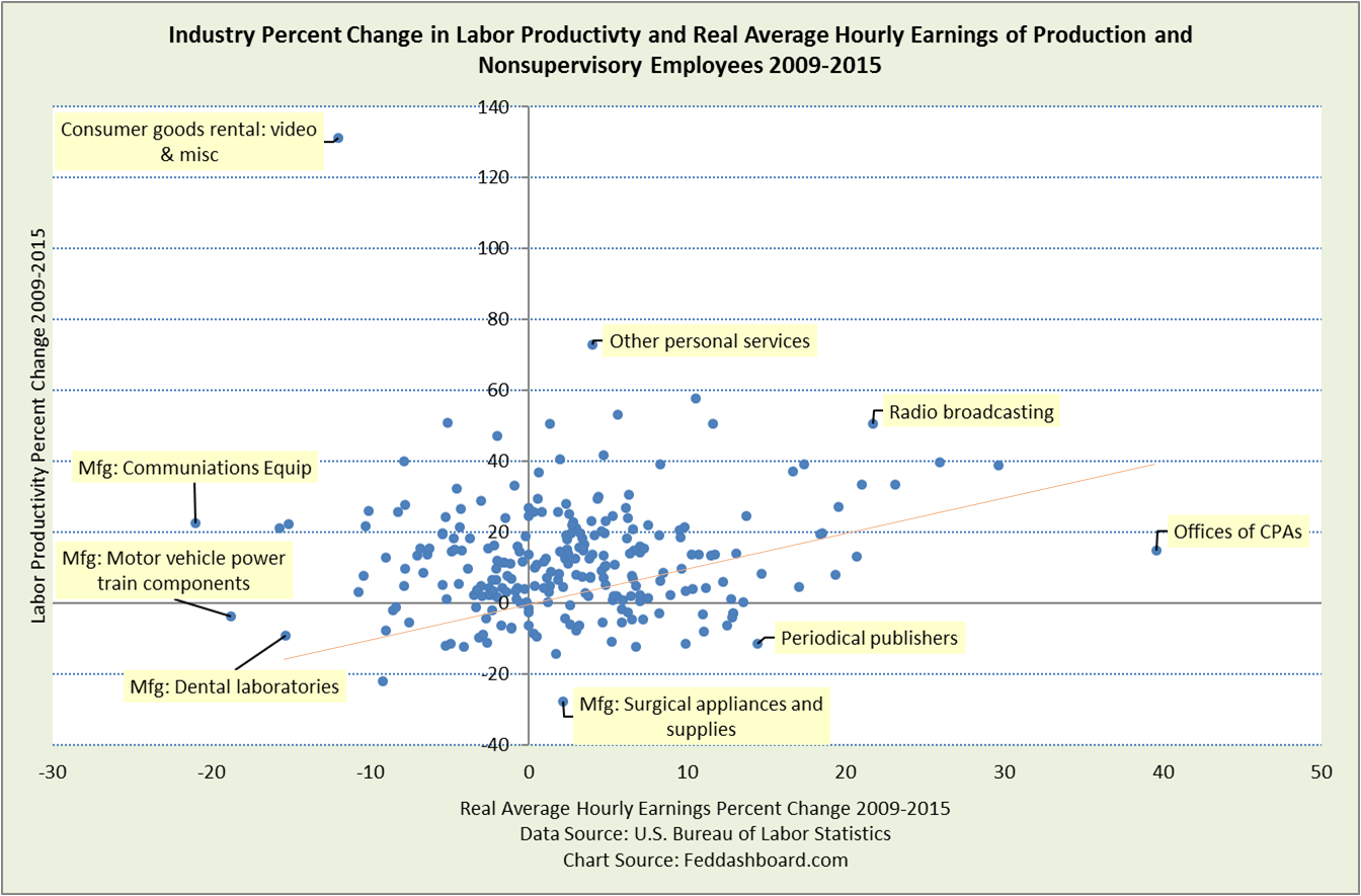
The dot chart below compares growth in Labor Productivity and real (price-level-adjusted) Average Hourly Earnings of production and nonsupervisory employees.
If people were consistently paid for labor productivity, the industry dots would hug the orange diagonal line. But, they don’t.
Instead, industries to the upper left and lower right are the opposite of theory. Dots to the upper left of the orange diagonal and especially in the upper left quadrant are bad for worker wages. But lower wages also mean the Fed should have less fear of “inflation.”
If the Fed wants to fight rising wage levels, then it could start by cutting bank regulation complexity to reduce demand (and wage pressures) for CPAs. The broader point is that industries have specific stories. Today, it’s not about “too much money chasing too few goods.”
 If you work at a CPA firm, you’re doing GREAT. In periodical publishing, workers are getting paid more for lower labor productivity. If you work in a dental lab, then it’s not so good.
The dots also provide insights to automation as we illustrated in “Your job’s future in three charts.”
- Automation helps some workers do more advanced tasks, such as artificial-intelligence-aided auditing services marketed by big CPA firms. Wages rise because of higher skill needed use AI tools.
- By contrast, a craftsman in a dental lab may be replaced by a lower skill worker who fills and empties a 3D-printer for dental implants. Here, measured labor productivity improves because hours worked decrease. But, the source of improved productivity is the machine and wages fall.
Central bankers are just beginning to realize how business cases are created for specific investments in improvements and how investors evaluate companies. Because business managers measure productivity differently from economists, central bankers misunderstand business actions and make mistakes in policy.
Policy-makers miss:
- Labor force and productivity are decreasing as constraints on growth. This is because labor is a shrinking share of inputs to tradable goods and services (many of which are digital), and inputs are increasingly abundant, as discussed in “Slack Attack – surprising evidence of how our economy changed.”
- Increasing productivity has less influence on “inflation.” It is difficult to find “inflation,” meaning monetary-driven price increases, beyond U.S. housing from Fed mortgage-backed securities purchases and importing inflation through currency devaluation from quantitative easing (especially in the Euro area and Japan) – price changes more often have specific causes.
- Instead, shoppers bought more as prices for goods and scalable services have fallen since the mid-1990s.
- Potential GDP is so high that it doesn’t really matter as a policy variable because resources are readily available and price-level pressures are low
- Monetary policy has little influence on these factors. Instead, deeper drivers are in the tech and trade transformation, and regulatory and fiscal policy. “Tech” includes both technology and management technique.
- Regulatory and fiscal policy could help lagging industries improve, but without a clearer understanding of the tech and trade transformation, policy-makers have missed the mark, as has been the case with health care proposals.
- Until policy-makers recognize the relevant data, policy errors will continue and people will suffer the distortions. Moreover, these errors – cascading through global funds flows and exchange rates — threaten global financial stability.
Investors miss:
- That macro is about 90% of the behavior of the S&P 500 and productivity matters because it both: informs industry and company selections and is an input to Fed decisions.
- Shifts in industry and company baseline performance depending on how a company manages its value chain. Similarly, companies providing outsourcing services (including manufacturing) need to be evaluated in view of these trends, service mix and provision location.
- Here, industry insights from Bureau of Labor Statistics data can be used in business model-based investing to seek higher returns
To learn more about how to apply these insights to your professional portfolio, business or policy initiative, contact “editor” at this URL.
Data Geek Notes:
- Average Hourly Earnings is used from the employee perspective in which the equity and “inflation” discussion is usually framed. Of course, the employer’s perspective includes the total cost of the worker and differentiated contribution of labor to the product.
- Production and nonsupervisory employees are about 80% of all workers; highly paid managers can skew the broader average.
- Industries for the scatter plot are the lowest level provided by the BLS where a match can be made between the two datasets, about 250.
- In the scatter plot, R-squared of the linear trend line is 0.0078 and has a beta (slope) of less than 0.19.

