
It’s true, worker wages today are better than ever. It’s also true that growth was once better. Clearing up confusion about wage health starts with the timeline.
Real pay per person — the “pocketbook” measure – is the wages and salaries portion of employee compensation. It excludes other sources of Disposable Personal Income – benefits (including medical), proprietor and rental income, interest, dividends and government support payments.
Given the buzz around the Federal Open Market Committee’s (FOMC) evaluation of the labor market, it’s time to update a few of our “go to” pictures.
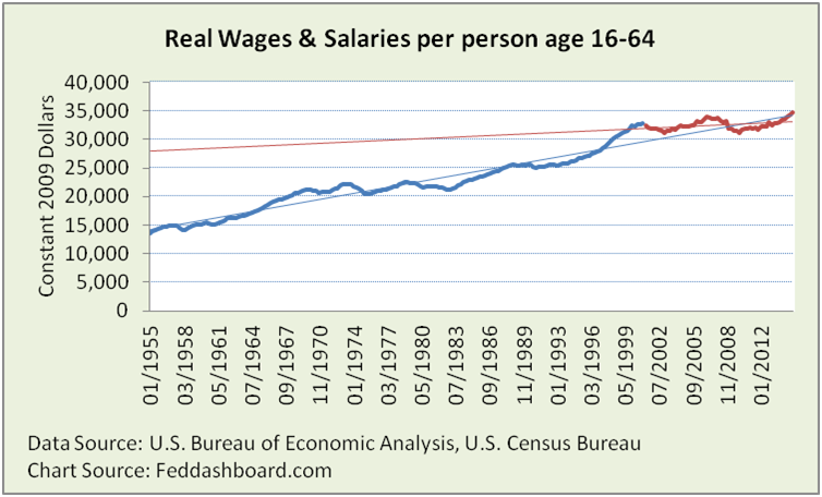
Real wages and salaries per worker are at an all time high. For Chair Janet Yellen, a labor economist, this broad average is good news.
As averages hide answers, what’s hiding in this average?
- Lifting this measure to all-time highs have been:
- Falling prices (including gas prices)
- Falling proportion of working age people – this started plunging in 2007 even before earliest baby boomers hit age 65.
- Rise associated with the FOMC’s Quantitative Easing (QE). Will this rise stay or pop like the rises from the tech and housing/credit bubbles?
- Hurting improvement have been:
- Since the early 1970s, downtrend of employee compensation relative to company sales and profits.
- Since 2000, weaker rewards to workers for improved labor productivity. But, don’t jump to conclusions about labor productivity. Measured labor productivity has appeared low due to lower investment in physical facilities, outsourcing, growth of the service sector and more. The influence of “Y2K, when workers hit the wall” is seen below in the color-coded graph line with slower growth starting 2001.
 Increases in other income are good for economic flows in our economy. Increases in medical benefits provide tangible benefit. But, these benefits are less tangible to a worker because 1) compared to other products, more of the price of medical products is inflation than tangible benefit received, and 2) part of the medical plan payment is effectively a tax. This amount is not counted as a tax because it flows through medical policy providers, not government.
Who’s the average worker?
As averages hide answers, we could drill down on demographics, industries, geographic areas and more. Short of space here, we’ll just point out that “average” isn’t really the person on the street. This is because the math average from elementary school is pulled up by a relatively small number of relatively high wage earners.
“Employed full time: Median usual weekly real earnings: Wage and salary workers: 16 years and over” is reported by the U.S. Bureau of Labor Statistics (BLS) in their Current Population Survey (“household” survey).
- Median — the wage at which half of full time workers (such as parents at a soccer game) are above and half below
- Usual — reported by the person responding to the survey, intended to filter out unusual overtime
- Real – adjusted for inflation with the Consumer Price Index
- Wages and salaries only, excludes benefits and other income
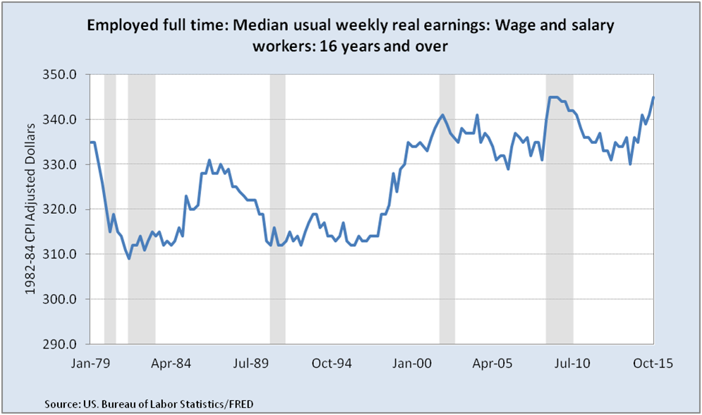 How does this median person feel? Better, at all time highs.
Do improvements in usual weekly real earnings come from increased hours worked or higher hourly wages?
Hours Worked Stable
- For goods workers, average (not median) hours worked have been on a slight uptrend since the credit-crash, increasing by about 1 hour per week from 2007 to 2012.
- For services workers, average hours worked were on a downtrend that flatted in about 2000. Notice the average has been less than the definition of “full time” of over 35 hours.
 Does this mean that people in services industries are working less than in goods industries? No. This survey of employer establishments only tracks hours worked by an employee for that employer. This is in contrast to the household survey that collects usual hours. Details matter.
- People working multiple jobs for their usual weekly earnings aren’t directly measured. For people in multiple jobs, extra preparation, commuting and child care time usually makes people worse off.
- Good news is that the ratio of part time to full time employed has continued to fall since 2010.
Hourly earnings growing
For hourly earnings, we look to the 12-month percent change from non-seasonally adjusted data. This avoids confusion from cumulative effects and debates about seasonal adjustments.
The headline is good – the trend from 2010 has been up to historical highs.
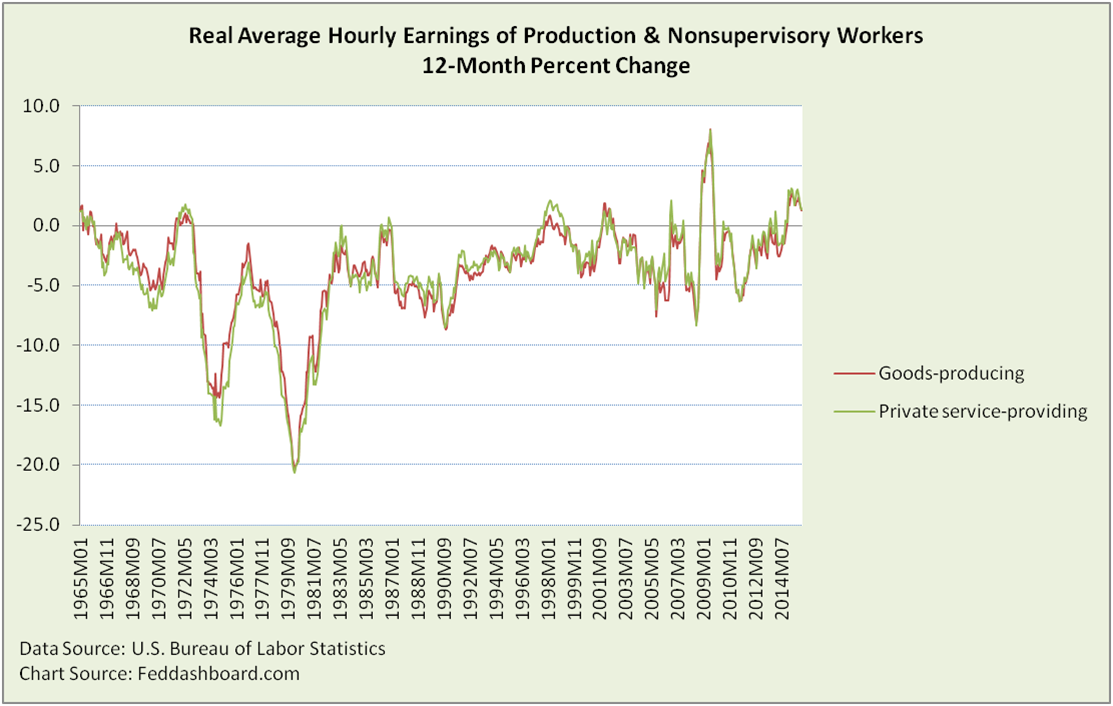 This wage growth is why Chair Yellen and others fear inflation. But, debt levels, PIPE Factors and 4Cs of consumer demand seem to be holding down a generalized price increase panic.
The break in the up-trend since November signals caution.
Caution – credit-based consumption
In a consumption-driven economy that has been credit-fueled since the early 1970s, it’s dangerous to overlook debt. Paying down debt and building savings is good – especially with an aging populace.
Bottom line:
- Wages are at all time highs — good
- Deeper trends tilt negative – caution
- Workers with multiple jobs usually have increased costs of working – bad
- Individuals each have their own reality, with more divergence due to the hollowing out of the middle class